Showing posts with label Everyday Engineering. Show all posts

Thursday, October 22, 2026

The Zipper Slider Is a Tiny Traffic Junction

A zipper asks your hand to make one simple movement while it quietly organizes hundreds of smaller ones. Pull upward on a jacket and two ragged edges become a reliable seam. The teeth do not individually know where to go. Their route has already been built into the small metal body under your fingers.

Conceptual cutaway of a brass zipper slider between separate and engaged rows on indigo cloth.
Conceptual cutaway. The internal arrangement is simplified; it is not a manufacturer drawing or a repair diagram.

The most useful way to inspect a zipper is to stop looking at its pull tab. The tab is a handle. The actual machine is the slider beneath it: a compact guide that brings two rows together or separates one joined chain. Once you recognize that distinction, a familiar object becomes a miniature lesson in directing movement.

Follow one tooth through the junction

YKK's cutaway explanation identifies a Y-shaped channel inside the slider. In the closing direction, the two branches lead separate rows toward a common exit. The guide constrains the position of successive elements so their shaped surfaces engage. Reverse the motion and a divider leads the joined rows apart again.

Imagine marking one tooth with a removable paper pointer beside the fabric. As the slider passes it, the tooth is guided sideways into an engagement with its neighbors. Then the slider moves on. The tooth stays in the seam; it does not travel the length of the garment with the handle. You are moving the location where joining happens, rather than carrying the whole chain through a stationary machine.

That distinction is easy to miss because our attention follows the moving handle. Try describing the action without using the word “pull”: a traveling guide successively changes the arrangement of parts fixed to flexible edges. The longer description reveals why a short slider can organize a long closure.

The seam has three cooperating materials

The manufacturer's basic parts guide groups a zipper into elements, slider and textile tape. Those parts divide the labor. The elements provide repeatable engagement; the slider supplies the route; the tapes connect a precise chain to a much larger, flexible object.

It is tempting to dismiss the tape as ordinary backing. But YKK's description of its woven tape shows different zones for different jobs. The edge supporting the elements has a cord-like structure. A denser region withstands contact with the slider. Another region supports sewing into the finished garment.

This makes the zipper a useful counterexample to the idea that good engineering always replaces soft material with hard material. A jacket needs both. If the entire closure were rigid, it could not comfortably follow the fabric. If every part behaved like loose cloth, the slider would have no dependable sequence of elements to engage. The useful behavior comes from arranging unlike properties next to one another.

A second mechanism decides when movement is allowed

Guiding the teeth and preventing unwanted slider movement are separate tasks. YKK illustrates locking sliders with small pins that engage the elements. In a pin-lock example, lifting the tab releases the pin. In an automatic-lock design, a gentle pull operates a spring-related mechanism. The exact movement depends on the slider type.

Watch how that changes the role of the tab. It can communicate an intention to move as well as transmit force. A lock lets the closure remain where it was left, while the same hand movement that starts opening also releases the restraint. A part that looks like decoration may therefore be linked to another action hidden inside the body.

This is why a single confident repair trick cannot fit every zipper. A closure that separates behind the slider, one that will not move, and one whose insertion pin is damaged present different symptoms. The visible problem identifies a question, not an automatic diagnosis.

Why harder pulling is often the wrong experiment

The manufacturer's care guidance warns that forcing a reluctant slider can damage the elements. Before applying any product-specific remedy, release tension on the fabric and inspect for caught lining or an obvious obstruction. Follow the garment and zipper maker's care instructions; delicate fabrics and coated closures may need different treatment.

The usage manual adds another useful complication: the finished garment changes the operating conditions. Sewing, laundering, material compatibility and the open-end components can all affect performance. A zipper is tested as a mechanism, but it is used as part of something else.

Next time you close a bag, pause halfway. Above the slider are two possibilities; below it is one joined edge. The machine at the meeting point is small because the work is sequential. Its success lies in making the same controlled event happen again and again, while your hand experiences only one continuous motion.

Sources and a closer look: YKK: the Y-shaped slider channel; YKK: the three basic parts; YKK: the woven tape; YKK: locking sliders; YKK Americas: care and slider questions; YKK usage instruction manual.

Explore art, experiments and other unexpected connections at Incoprea.

Why a Bicycle Wheel Carries Weight by Losing Some Tension

The fragile-looking part of a bicycle wheel is doing something surprisingly robust. Its thin wires can pull hard, yet they would buckle easily if asked to act as little pillars. A rider can nevertheless sit above them. The explanation begins before the rider arrives: the spokes are already under tension.

Think of an unloaded wheel as an organized argument. Spokes pull the rim inward and the hub outward in many directions. Their forces balance. Put weight on the axle and the balance changes. In an ordinary tension-spoked wheel, a major part of the response is a decrease in tension among spokes near the ground contact region. They still pull, but they pull less.

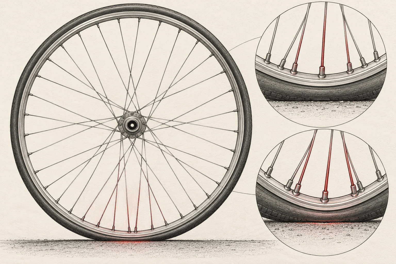
A bicycle wheel illustrated with its hub, rim and fine spokes, with the lower loaded region highlighted.
Conceptual wheel study. Color highlights identify a region of interest; they are not measured forces or a wheelbuilding specification.

Subtracting a pull can create support

This is not a claim that the bottom spokes become compression columns. Imagine two opposed cords each pulling with 100 arbitrary units. Their net force is zero. Keep the upper pull at 100 and reduce the lower pull to 80: the remaining net force is 20 upward. Neither cord has pushed. An imbalance between existing pulls has appeared.

That is a deliberately stripped-down analogy, not a complete wheel model. A real rim bends, many spokes change force, and their directions differ. It nevertheless answers the apparently impossible question: how can a structure respond to a downward load through wires that work in tension? It can change forces that were present already.

In his analysis of torque and spoke tension, bicycle engineer John S. Allen also describes weight loading as reducing tension in spokes near the tire contact patch. The local group matters more than the picturesque idea that the axle simply stretches all the top spokes like a person hanging from ceiling ropes.

The rim is a partner, not a decorative circle

Henri Gavin's experimental study of bicycle wheels combined numerical analysis, laboratory measurements and riding data. It treated rim stiffness, spoke geometry and spoke dimensions as parts of one structural system. Strain gauges let the researchers measure changing deformation rather than infer it from how strong a wheel looked.

The study compared three lacing patterns. Within the tested conditions, spoke strains under radial loading were relatively insensitive to that pattern. That result has a boundary: it does not establish that every wheel, load direction or rim behaves identically. It does show why a visual feature such as the number of crossings cannot stand in for an entire mechanical assessment.

A useful reading habit is to ask what the experiment held similar and what it changed. “These tested patterns produced similar strain behavior under these loads” is a meaningful result. “Spoke patterns do not matter” discards the very conditions that make the result useful.

Part of the systemQuestion it helps answer
Initial spoke tensionHow much can a spoke unload before it becomes slack?
Rim stiffnessHow does a local load spread around the circumference?
Lacing geometryHow can changing spoke pulls transmit hub torque?
TireHow does the road contact load reach the rim?

Driving and braking add another conversation

A rear hub must also transfer pedaling torque to the rim. A hub brake transfers braking torque in the opposite direction. Allen's torque account explains these through increases in tension in one group of spokes and decreases in another. A crossed arrangement lets spokes leave the hub at an angle, giving their forces a turning effect about it.

Notice the recurring theme. The spokes need not become rigid shafts twisting between hub and rim. Their changing pulls can transmit a turning action. The geometry determines how effectively those pulls act around the axle. A wheel therefore answers more than the vertical-weight question posed by a stationary rider.

A listening exercise with an important limit

A stationary, undamaged wheel offers a quiet way to encounter its stored tension. With the bicycle securely supported and the wheel completely stopped, lightly pluck a spoke away from moving drivetrain parts. It can ring like a short string. Allen's discussion of spoke pitch explains the connection among pitch, tension, effective length and spoke construction.

Compare that sound with a second spoke of similar geometry. You are hearing a mechanical condition, but not reading a universal tension number. Crossings, lengths and spoke types complicate comparisons. A different sound is a reason to understand the wheel's design, not an instruction to turn a nipple until every sound matches. A wheelbuilder uses the rim and hub maker's limits and appropriate measurements.

For a paper exercise, draw a wheel at four positions in one revolution and mark a single spoke. In each drawing it approaches, passes and leaves the loaded region. Even if the rider's weight stays steady, that spoke's loading history changes cyclically. This is the bridge from a static support question to a fatigue question: repeated variations can matter even when a single event is well below breaking strength.

The wheel's elegance lies in making that repeating cycle ordinary. You see a thin circle, a hub and a lacework of wires. Hidden in the apparently empty space is an intentionally prepared state of stress. The rider does not create the whole structure's strength by pressing down. The wheelbuilder has arranged forces in advance, and the road continually redistributes them.

Sources and a closer look: Gavin: measured spoke strain and fatigue; John S. Allen: torque and spoke tension; John S. Allen: spoke pitch and tension; Sheldon Brown: wheelbuilding.

Explore art, experiments and other unexpected connections at Incoprea.
The QR Code Can Lose Pieces and Still Speak

A coffee stain can cover part of a QR code and the phone may still read it. That small success hides two different problems. First the reader has to find and geometrically interpret a square in a messy view. Then it has to recover a message whose visible marks may contain mistakes. A code that solves only the second problem might still be unreadable.

A deliberately nonfunctional code-like matrix with torn patches and conceptual reconstruction tiles.
Conceptual artwork, not a scannable QR code or a demonstration of a particular correction threshold.

The extra information is not merely the same web address printed repeatedly. The message is encoded with mathematical redundancy: relationships among codewords that allow a decoder to detect and correct certain errors. A codeword is a group of bits, not one black square. The distinction matters whenever someone claims a logo can safely cover a particular fraction of an image.

What the familiar percentage actually describes

DENSO WAVE's error-correction explanation identifies Reed–Solomon coding and four levels of protection. The commonly quoted approximate restoration levels—L 7%, M 15%, Q 25% and H 30%—refer to total codewords, not a guarantee that any matching percentage of the printed area can be erased.

Where damage lands matters. So do the geometry and the pattern that a reader must locate before decoding. A rectangle over a critical locating feature is not equivalent to the same number of damaged data modules spread elsewhere. Error correction is a designed capacity within a reading system; it does not make that system indifferent to its input.

Here is a separate, much simpler analogy. Write three numbers and a check total: 4, 7, 2; total 13. If one number is known to be missing, subtracting the other two from 13 recovers it. But if a number is merely wrong and you do not know which one, that single check does not identify the problem. Real error-correcting codes use more powerful relationships. The example shows why detecting a mismatch, locating an error and rebuilding a value are different achievements.

The square has to announce itself first

In the developer's history, Masahiro Hara's team focused on finding a symbol quickly, rather than maximizing capacity alone. The prominent position patterns were designed to be distinguishable from surrounding printed matter. Their black-and-white run ratio helps the reader recognize a candidate code at different orientations.

That design choice gives a useful lesson for people making posters: the parts that seem like decorative framing are doing work. Treating the three conspicuous corner patterns as spare space misunderstands their job. A human may still recognize “something QR-like” after an alteration, while the decoder has lost the geometry it needs.

The empty space outside the code also counts. The official layout guide specifies a clear quiet zone four modules wide on every side for a standard QR code. The white border is part of the reading conditions, even though it contains none of the message.

More protection has a cost

The official version guide explains that a symbol's capacity depends on its version, character mode and correction level. Version 1 has 21 modules per side; subsequent versions add four per side, up to Version 40 at 177. Increased protection uses capacity that could otherwise hold message data. For a fixed message, the needed version can therefore increase.

Imagine two posters with the same physical square size. If one symbol needs more modules, each module becomes smaller. The extra mathematical protection may be useful, but printing and focusing now have a more demanding pattern to resolve. “Choose the highest level” cannot replace checking the finished print under intended conditions.

You can do a layout calculation without a phone. Suppose a chosen symbol has 29 modules per side and you allot 0.5 millimeters to each module. Its patterned square is 14.5 millimeters wide. Including four quiet-zone modules on each edge adds eight modules, so the total allocation is 37 × 0.5 = 18.5 millimeters. That is a geometry example, not a recommended minimum size for every application.

A successful read is only the first success

A QR code may contain a web address. Recovering the characters does not demonstrate that the destination still exists, that a redirect is dependable, or that the page is useful on a phone. The printed symbol and the service behind it have different lifetimes. A good publication check follows the whole experience from paper to readable content.

This is the deeper reason the battered square is interesting. It joins recognition, geometry, error correction, manufacturing and a reader's task in one small object. Its resilience comes from anticipating imperfect conditions at several levels. The coffee stain is simply where that preparation becomes visible.

Sources and a closer look: DENSO WAVE: error correction; DENSO WAVE: development history; DENSO WAVE: quiet zone and print area; DENSO WAVE: versions and capacity.

Explore art, experiments and other unexpected connections at Incoprea.

E Ink: The Page That Needs Power Mainly to Change Its Mind

An e-reader can look almost stubborn after its battery dies. The last page may remain on the screen, even though pressing the buttons does nothing. This is not necessarily a frozen computer continuing to display an image. In an electrophoretic display, the visible arrangement can persist after the power that created it has gone away.

That detail shifts the question from “How is the screen lit?” to “What physical state is the screen holding?” Ordinary ink stays where a printer puts it. Electronic paper instead lets an electric field rearrange tiny pigment particles, then takes advantage of their ability to remain in a visible state.

A matte electronic-paper page above a conceptual magnification of black and white particles in capsules.
Conceptual illustration. Capsules are enlarged and simplified; the image is not microscopy or a product specification.

A page assembled from moving pigment

In its two-particle technology explanation, E Ink describes black and white particles suspended in fluid inside tiny capsules. Applied fields move particles so that the viewer sees a lighter or darker surface. The drawing above enlarges this idea enormously; neither its spheres nor their spacing should be read as a microscope image.

The device does not move a printed letter bodily from one position to another. It changes the appearance of many small locations to form a new arrangement of strokes. On the scale of a page, the result resembles writing. On the scale of the material, the job is to control which pigment contributes to what the reader sees.

A helpful analogy is a reversible display made from tiles. If tiles can hold their chosen face without continuous effort, changing a sign takes work but leaving it readable need not. The analogy leaves out the electrical waveform, fluid behavior and addressing electronics, but it identifies the important separation between making a state and maintaining it.

The battery claim needs a boundary

The manufacturer calls this property bistability: an image can remain with power removed. That describes the display's holding behavior. It does not mean an entire e-reader uses no power whenever a person pauses. A processor, touch system, wireless connection or lamp may still consume energy.

Try a deliberately fictional budget. Suppose a display update uses one energy token and holding its state uses none, while a reading lamp uses two tokens per minute. Turn one page every two minutes for twenty minutes. The display would spend ten tokens on ten changes; the lamp would spend forty. These invented numbers are not measurements of a product. They show why “power only when changing” cannot predict device battery life without a system boundary.

The same thought experiment explains why an infrequently changing sign suits a different display task from fast video. The first spends much of its life holding useful information. The second repeatedly requests new states. A material advantage that depends on quiet intervals becomes less decisive when quiet intervals disappear.

Reflecting light changes the reading experience

E Ink's account of reflective reading explains that the pigments return light from the environment. The page itself does not need a backlight shining through it. In a dark room, however, reflected light has to come from somewhere: a room lamp or a device's optional front light. Reflection does not create illumination.

This gives a simple observation sequence. If you own an e-reader, turn its front light off and view the same page in a bright room, by a window and in a dim corner. Keep the font and page unchanged. You are varying the light reaching the surface while holding the page content still. Compare with a printed page nearby rather than relying on memory of how bright it looked a minute ago.

Now change the display's font size. A longer pause or a brief refresh appearance belongs to the updating process, not to the act of holding the old image. Write down separately what happens while the page changes and what happens after it settles. The separation is more informative than deciding whether the whole device “feels like paper.”

Color electronic paper is more than one recipe

One color approach places filters above a black-and-white ink layer. E Ink's Kaleido description lists the backplane, ink layer, color-filter layer and protective sheet. Other electronic-ink families use multiple colored pigments. Calling all of these “tiny black and white balls” loses the difference between the optical material and the layers added around it.

For a reader choosing how to present a map, this matters more than the marketing label. Can symbols be distinguished in grayscale? Does the legend depend on two similar pale colors? Does small colored text remain legible? Those are questions to test on the actual display, rather than infer from the number of colors its specification names.

ObservationUseful next question
The page stays when power disappearsIs the image retained, or is the device still responding?
The page is hard to read in darknessWhat external or front lighting reaches the reflective surface?
A page turn behaves differently from a static pageWhich part of the experience belongs to updating?
A colored chart loses clarityDoes the chart also work through labels, shapes and contrast?

The enduring page is a small reminder that a computer's output can have a physical memory of its own. The pixels do not have to repeat the act of displaying every moment in the same way. Sometimes the cleverest energy-saving move is to make a useful change, then let the material remain exactly where it was put.

Sources and a closer look: E Ink: electrophoretic particle systems; E Ink: bistability and reflection; E Ink: paper-like reading; E Ink: Kaleido layer structure.

Explore art, experiments and other unexpected connections at Incoprea.

The Hidden Geometry That Makes Road Signs Shine Back at You

An anonymous road sign shines in headlights beside a quiet dark road.
Night-road illustration. Apparent brightness is artistic and does not represent a measured sign performance.

At night a road sign can appear to switch itself on as a car approaches. Yet the sign may have no electricity, lamp or stored glow. Its surface is arranging a return journey: some of the light from the headlights is being sent back toward the place it came from. Because the driver's eyes are close to that place, the sign becomes conspicuous.

This is retroreflection. A shiny mirror also reflects light, but its bright reflection depends on a particular geometry. A retroreflective surface is designed to return light toward its source over a useful range of directions. The difference is not how expensive or glossy the surface looks in daylight. It is where the outgoing light goes.

Three different answers to a beam of light

Imagine aiming a flashlight at three samples: matte card, a mirror and a strip of reflective material. A matte surface spreads reflected light into many directions. A mirror sends a narrow reflection along the direction fixed by its orientation. Retroreflective material returns a substantial part of the beam toward the source. 3M's optical primer diagrams these three behaviors.

That means “reflective” is too broad a word to predict a driver's experience. A polished surface can direct light away from the observer. A surface that looks relatively unremarkable in a room can be very effective when illuminated from near the eye. The useful comparison specifies the light source and observer together.

The pattern is smaller than the message

The Federal Highway Administration's explanation identifies two common approaches: tiny glass beads and very small cube-corner structures. Both can be built into sheeting that covers a sign. A large printed instruction thus depends on an optical structure too small for a driver to inspect while reading it.

A cube corner is easiest to imagine as the meeting of three mutually perpendicular mirror faces. Reflections reverse the direction components of an incoming ray, sending it back roughly parallel to its arrival direction. That is a geometric account of an idealized element, not a claim that every ray entering a real sheet returns perfectly. Actual products have limited angles, finite efficiency and protective layers.

The engineering task is subtler than building a perfect return to one mathematical point. Headlights and eyes are separated. Light returned only to the exact filament location would not help the driver above it. Real useful reflection has an angular distribution that includes the intended observer.

The observer is part of the apparatus

The manufacturer's discussion of observation angle distinguishes the incoming headlight line from the line returning to an observer. A larger separation angle can reduce apparent brightness. This helps explain why the same sign can present different conditions to different vehicles without changing its material.

Try an original geometry estimate. Let a light and an eye be separated vertically by one meter. At a target distance of 100 meters, the small observation angle is approximately 1/100 radian, or 0.57 degrees. At 20 meters, the same separation corresponds to about 2.9 degrees. These are simplified straight-line calculations, not a sign specification. They show why distance and observer height belong in the question.

There is also an entrance angle: how the arriving beam approaches the surface compared with its perpendicular. Do not confuse that with the light-to-eye separation. One describes the sign's presentation to the beam; the other describes the observer's relationship to the source. A meaningful measurement records the geometry rather than announcing one context-free brightness number.

A daytime glance cannot finish the inspection

FHWA's guidance describes assessment and management of sign retroreflectivity, including measurements and nighttime inspection methods. That practical work follows from the optical difference: readable paint in daylight does not by itself establish an adequate light return at night. Material age, condition and viewing circumstances matter to the sign's actual task.

A useful analogy is a microphone tested without a listener's room. The device has measurable properties, but the final experience depends on its arrangement. For a sign, the material, headlight beam, distance, alignment and observer all participate. Improving only the apparent color on a sunny afternoon can miss the part of the system that matters after dark.

The next time a sign brightens through a windshield, the apparent little lamp is worth a second thought. The sign is borrowing light and returning it to a useful neighborhood. A message large enough to guide a vehicle depends on an immense population of tiny structures, each doing a modest piece of geometry.

Sources and a closer look: FHWA: sign retroreflectivity and materials; 3M: optical principles and viewing angles; 3M: observation angle and returned light.

Explore art, experiments and other unexpected connections at Incoprea.

The Camera That Records Different Moments in One Photograph

A conceptual street scene is assembled from horizontal strips to evoke line-by-line timing.
Temporal collage. It illustrates an idea, not a camera test or an actual captured rolling-shutter example.

A straight post leans in a photograph taken from a moving train. A propeller seems to bend into disconnected blades. The easy explanation is “the camera was too slow,” but that phrase hides two different times. A row of pixels may have a very short exposure while the whole image still spans a longer sequence of moments.

Rolling shutter is the process that makes those moments coexist in one rectangular frame. Different rows begin collecting light at different times. If the subject or camera moves between them, the finished image assembles a shape that no single instant contained. The sensor has recorded a timetable as well as a view.

Short exposure does not mean simultaneous exposure

Basler's technical documentation describes the row-to-row temporal offset. In a conventional rolling sequence, the first row starts, then the next begins after a delay, and the process continues across the selected image region. Each row can have the same exposure duration while occupying a different interval on the clock.

Picture a person surveying a building through a narrow horizontal slot. They draw the roof first, the middle later and the foundations last. If the building moves sideways during the survey, the copied roof and foundations belong to different positions. Their drawing may be sharply rendered in every strip and still fail to represent one undistorted building.

By contrast, a global exposure aligns the integration interval across the image. That does not abolish motion blur: a moving object can still travel during a long exposure. It changes whether all image locations share the same interval. Blur within an interval and geometric displacement between intervals are different effects.

Build a frame out of times

Use a deliberately simple numerical example. Suppose the first row begins at 0 milliseconds and the last at 20 milliseconds. Every row exposes for 1 millisecond. An object moving sideways at 1,000 image pixels per second shifts 20 pixels between the first and last starting times, although it moves only one pixel during each row's individual exposure.

Those invented values are not a measurement of a phone. They show why changing the exposure from 1 millisecond to 0.5 millisecond does not automatically remove a 20-millisecond scan interval. The strips can become sharper while the assembled object's lean remains. To change the lean, one must also consider row timing and motion.

QuestionTime quantity to inspect
Why is a moving edge smeared?How far it moves during each pixel's integration interval
Why do straight edges lean?How far the scene shifts between row exposures
Why do successive frames differ?How camera motion and acquisition timing vary from frame to frame
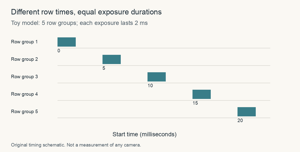
Five row groups begin at 0, 5, 10, 15 and 20 milliseconds; every exposure lasts 2 milliseconds.
Original timing schematic: the equal-width bars represent equal exposure durations starting at different times. These invented values do not describe a particular camera.

The geometry is a research problem too

In Geometric Models of Rolling-Shutter Cameras, Marci Meingast, Christopher Geyer and Shankar Sastry developed projection equations that account for different camera motions. Their point was larger than a funny propeller image: treating a rolling frame as one instantaneous central projection can bias estimates of scene geometry and camera motion.

A photograph used for reconstruction is therefore a measurement whose acquisition model matters. The same visual artifact that makes a vacation image amusing can become a systematic error when software uses many such images to infer the shape of a room. The answer is not to call all distorted images useless, but to understand the timing assumptions of the method.

Why use a rolling shutter at all?

Basler's engineering introduction explains why rolling designs can be useful for stationary or slowly moving inspection tasks. Sensor architecture affects sensitivity, noise, cost and readout. A design chosen for one application can be a good tradeoff even if it produces unwanted geometry in another.

Sony's account of its industrial sensors similarly discusses pixel design and column-parallel conversion as routes to low noise and sensitivity. Those are descriptions of particular technology families, not a universal ranking in which every rolling sensor outperforms every global sensor. The acquisition task defines which properties matter.

A camera does not merely decide which photons belong to a photograph. It decides when each part of that photograph happens. The leaning post is a visible trace of that hidden schedule. Once you know to look for it, “a picture of a moment” becomes a more interesting and more conditional phrase.

Sources and a closer look: Basler: electronic shutter timing; Meingast, Geyer and Sastry: rolling-shutter projection models; Basler: rolling-shutter camera design; Sony: industrial rolling-shutter technology.

Explore art, experiments and other unexpected connections at Incoprea.

The Two Holes That Let a Kettle Sing

A kettle's rising rush becomes a note. Water is boiling, vapor is leaving, and a small cap on the spout turns flowing fluid into a signal you can recognize from the next room. The cap has no vocal cords. In a classic design, two nearby plates with holes create a compact aeroacoustic system.

The interesting question is not merely why escaping steam makes noise. A hair dryer also drives fluid through an opening without necessarily producing one strong whistle. The scientific puzzle asks how energy in a flow is organized into a dominant oscillation, and which parts of the geometry determine that behavior.

A whistling stovetop kettle and spout cap appear in a warm kitchen still life.
AI-generated editorial illustration. The visible white plume represents condensed droplets; the image is not a flow visualization or acoustic measurement.

The holes participate in a conversation

Ross Henrywood and Anurag Agarwal's 2013 study, The Aeroacoustics of a Steam Kettle, investigated a hole-tone arrangement with two orifice plates separated by a short cavity. A flow passing through the first opening forms a jet that interacts with the downstream opening and surrounding acoustic system.

A useful conceptual loop is: a disturbance in the flow produces pressure variation; the acoustic response affects the flow; the changed flow reinforces a compatible oscillation. A steady supply of energy can thus maintain a changing signal. The note is not a container of sound stored in the spout—it is a continuing exchange.

This is an explanatory feedback picture, not a full equation for every kettle. Actual geometry, flow and acoustic boundaries decide which oscillations grow and which fade. The paper's value is in relating measured behavior to specified mechanisms rather than assigning one universal story to every noisy opening.

One kettle can have more than one regime

The University of Cambridge's account of the research distinguishes a low-flow behavior resembling a Helmholtz resonator from a higher-flow whistling mechanism involving jet disturbances and vortices. At low flow the tone could remain near a fixed frequency; the system did not need to wait for the same vortex behavior associated with higher flow.

A Helmholtz analogy is an enclosed volume linked to an opening, with moving fluid in the opening and compression of fluid in the cavity cooperating in an oscillation. The bottle-note comparison helps identify the kind of system. It does not mean blowing across a bottle and driving steam through a kettle cap are identical flow arrangements.

The important word is “regime.” An explanation that works under one range of conditions need not govern the whole process. As the flow changes, a different feedback mechanism can dominate. Hearing one object throughout the sequence can make that transition easy to overlook.

Listen for change without changing the hardware

During ordinary use of a whistling kettle, an adult can notice whether the onset is a faint tone, an unstable chirp, a rising pitch or a stronger nearly steady whistle. Stop observation when it is time to remove the kettle from heat according to its instructions. Never block a spout, alter a hot cap or prolong boiling to collect a better recording.

A written listening record can include onset, pitch trend, loudness trend and duration. Those categories are observations. “A vortex appeared at this moment” is a mechanism claim that the sound alone does not establish. A useful notebook keeps those levels separate.

What a spectrum would add

A recording's spectrum can reveal energy concentrated near a frequency and its harmonics, while a time-frequency plot can show whether a tone changes. Neither image by itself reveals every causal step. A bright line establishes a property of the recorded signal, not a direct photograph of a vortex.

Suppose a fictional recording has a strong component at 2,000 Hz and another at 4,000 Hz. The second lies at twice the first frequency. That relationship is consistent with harmonic structure, but it does not uniquely identify a physical mechanism. Several oscillators can create periodic signals with harmonics. Geometry and controlled changes provide the additional evidence.

The researchers' Cambridge Acoustics Lab page supplies the study citation so a reader can distinguish the original paper from a popular summary. Following that trail is especially useful when a headline says a familiar mystery has been “solved.” The meaningful claim concerns the modeled and tested arrangement, not the disappearance of every open question about whistling flows.

The kettle is a small engineering lesson

A strong tonal sound can be helpful when it announces boiling water and unwelcome when it appears in a ventilation system. Understanding the route from flow energy to oscillation can inform both adding a signal and suppressing an unwanted one. That is an engineering inference from the mechanism, not a claim that one kitchen study automatically fixes every noisy pipe.

The next whistle can therefore be heard at two levels. It is a practical call from the stove. It is also a small example of a much broader process: flowing energy selects an oscillation, geometry helps shape it, and a steady input becomes a repeated pressure change that travels across a room.

Sources and a closer look: Henrywood and Agarwal 2013: original kettle aeroacoustics study; University of Cambridge: mechanisms and experimental account; Cambridge Acoustics Lab: study citation.

Explore art, experiments and other unexpected connections at Incoprea.
The Loops That Make Velcro Work—and Eventually Stop Working

A strip holds firmly when pulled one way and opens easily when peeled from an edge. Hook-and-loop fasteners turn thousands of small catches into a closure whose behavior depends on direction. Their familiar ripping sound is the audible trace of many tiny engagements giving way.

A conceptual magnification shows tiny hooks catching flexible textile loops as two strips separate.
AI-generated material study, not microscopy. Hook shape and loop construction are illustrative and do not specify a commercial product.

VELCRO is a brand name; hook-and-loop describes the general fastening mechanism. The name is useful here because the manufacturer's own technical explanations make clear that there is no single universal combination of hook, loop, strength and lifetime. A soft clothing closure and an infrequently opened industrial attachment can ask different things of the same basic idea.

The rough side and the soft side have different jobs

Velcro Companies' mechanism guide describes hooks engaging a matching loop material. Pressing the surfaces together creates many opportunities for contact. Separation requires those engagements to release, bend or otherwise disengage according to the design.

The key word is “matching.” A patch that feels rough and another that feels fuzzy are not automatically a high-performing pair. Hook shape, loop construction and material flexibility affect how they engage. The closure is an interface, so looking at only one half cannot explain its behavior.

Try the mental image of a small crowd holding loosely linked hands. Pulling everyone apart simultaneously asks something different from starting at one edge and successively releasing one short row. The analogy leaves out the actual mechanics of fibers, but it prepares a useful question: how much of the connection is being challenged at once?

Peel, shear and direct separation are different tests

The manufacturer's explanation distinguishes peeling from an edge, sliding the faces in opposite directions, and pulling them directly apart. These loading modes can produce very different results. The Professional Series technical brochure lists peel and shear performance separately for specified products rather than giving one context-free “strength.”

That difference is more than a terminology lesson. A label reporting force per width for peel does not represent the same test as a shear value per area. Comparing the numbers without their units and method can make one product look stronger for the wrong reason.

A useful reading exercise is to copy a datasheet value with all its qualifiers: product, test direction, units, sample width or area, and relevant conditioning. If only the number survives into your notes, much of its meaning has been lost. The article does not provide a load rating for a homemade attachment.

How you pullWhat to notice
Peel back from one edgeThe release front moves across the closure
Slide the engaged faces apartMuch of the engaged area resists at once
Pull directly away from the faceThe separation mode differs from progressive peeling

A gentle comparison is enough

Use an unloaded reusable cable strap or a spare small closure. Engage the same length each time with similar hand pressure. First peel it gently from an edge, then re-engage it and try a modest sideways pull. Describe the direction and feel rather than estimating a force from your fingers.

If one trial used twice the overlap or a much harder closing press, it is not the same comparison. Those changes may be interesting, but record them as separate variables. Do not test by suspending valuables or people; the point is to understand the mechanism with an empty sample.

Now listen to the release. A continuous-seeming rip contains many small events. The sound helps make the progressive nature of opening noticeable, but it is not a calibrated measurement of holding strength. A quieter product can be designed to behave differently without necessarily being defective.

Sometimes the closure is crowded, not exhausted

The manufacturer's cleaning guide explains how hair and lint can obstruct engagement. It recommends removing debris with suitable simple tools and keeping closures fastened when not in use or during permitted laundering. Follow the specific garment's care directions rather than applying one washing rule to every attachment.

This separates two possibilities that everyday language often merges. “It no longer grips” can mean the hooks and loops cannot reach each other because debris occupies the space. It can also mean the material has worn or been damaged. Cleaning may address obstruction; it cannot promise to rebuild a broken hook or restore every distorted loop.

For a small maintenance record, photograph the unloaded closure before cleaning, remove lint gently according to its care guidance, and compare the same overlap afterward. If the feel improves, that supports obstruction as part of the problem. It does not tell you the closure's original strength has been fully restored.

The backing can fail while the tiny catches survive

An adhesive-backed patch adds another interface: the bond between the fastener and the object. A sewn patch adds stitches and fabric. If the whole patch lifts away while hooks remain engaged, the failing connection may be behind the fastening surface. The visible symptom belongs to a chain of connections, not just the material that makes the ripping sound.

This is an original system-level inference rather than a product-specific repair prescription. It suggests a better inspection question: where did separation actually occur? A hook-and-loop interface, its adhesive layer and the supporting fabric can each have a different job and a different limitation.

The fastener's everyday elegance lies in its deliberate imbalance: many catches cooperate to hold, while an edge lets a hand release them progressively. Once you recognize that arrangement, a worn cable strap becomes a readable little structure. Its strength, sound and eventual failure all depend on how two textured surfaces are brought together—and on which direction they are asked to let go.

Sources and a closer look: Velcro Companies: mechanism and load directions; Velcro Companies: product-specific peel and shear data; Velcro Companies: cleaning and care.

Explore art, experiments and other unexpected connections at Incoprea.

The Elevator With Three Working Buttons

Case 50 · shortest-path challenge · Hard · About 10-15 minutes The archive elevator has a peculiar test mode. Its floor display works, but o...