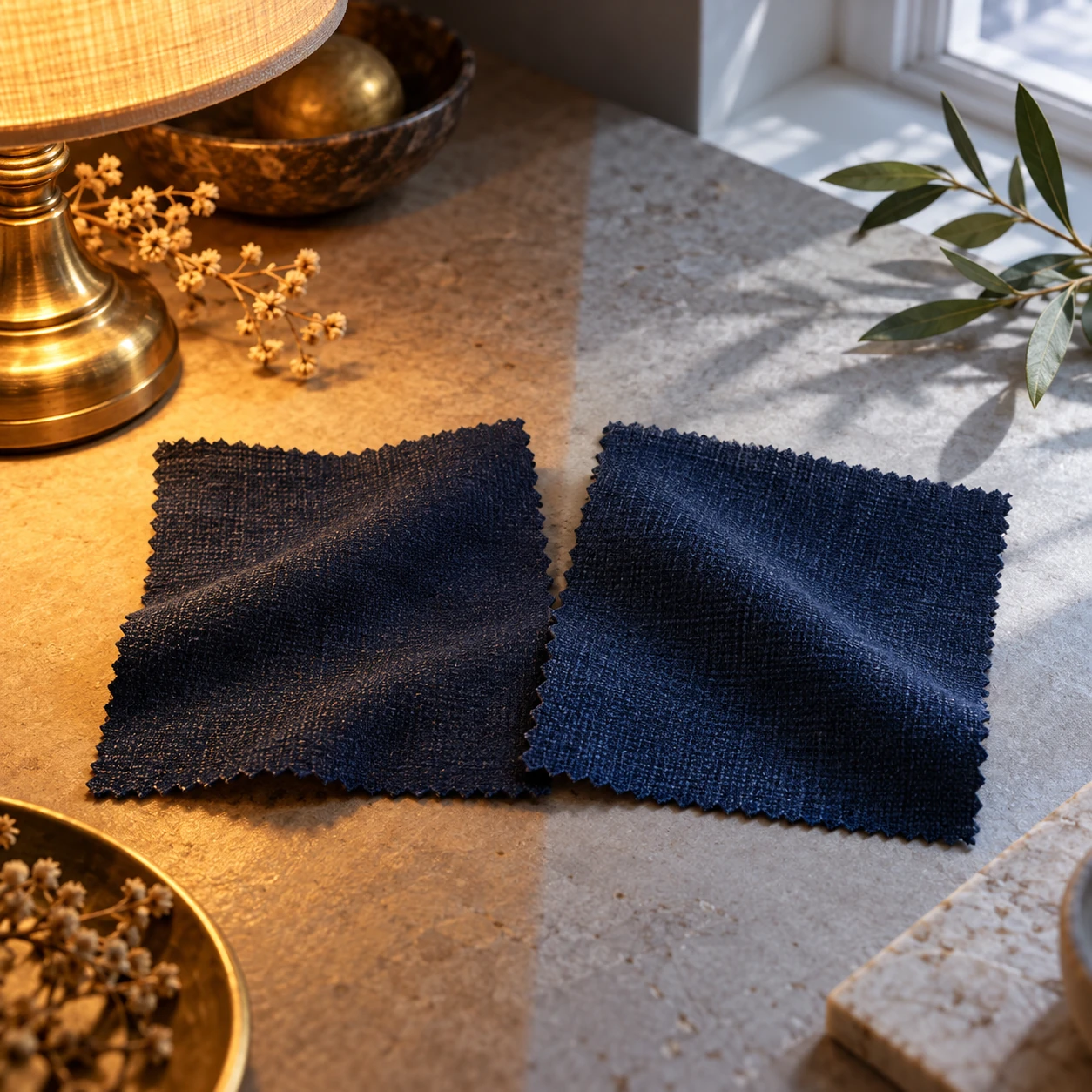
Showing posts with label Color. Show all posts

Saturday, October 24, 2026

Two Matching Colors Can Stop Matching When the Light Changes

Two pieces of fabric look like a good match in a shop. Beside a window, one seems greener. Under another lamp, the agreement returns. It is tempting to say that one of the colors has changed its mind. The more useful explanation asks what light each surface sends to your eye.
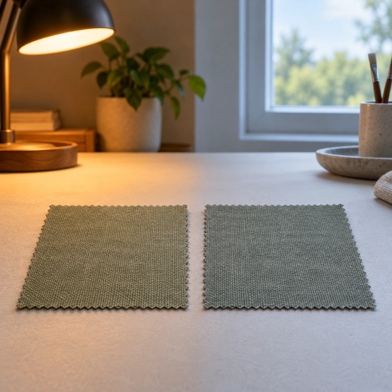
Two gray-green fabric swatches sit between warm lamplight and cool window light.
A conceptual comparison of color under different illumination. These rendered swatches are not measured metameric materials.

A color match is an observation made under conditions. It involves the illuminating spectrum, the object's reflectance, the viewing arrangement, and the observer. A label such as gray, navy, or cream compresses that situation into a convenient word. The compression is useful until two materials expose what it leaves out.

Different spectra can lead to a similar result

NIST's metamerism definition describes colors perceived as matching despite different spectral profiles, with differences often becoming visible under changed illumination. The important point is not merely that warm lighting makes things look warmer. Two materials can respond differently to the same lighting change.

Imagine two teams whose total scores are equal, even though the points came from different events. Change how events are weighted, and their totals may separate. In color, the spectrum of incoming light changes which parts of each surface's reflectance matter to the light reaching the eye. The analogy explains conditional agreement; it is not a color-calculation method.

Change one condition on purpose

Find two ordinary physical items that already appear similar in color. You do not need to buy samples. Compare them adjacent to one another under a diffuse daylight source, then under a room lamp. Keep both at similar angles and move them together. Avoid direct sun, glare, and looking into lamps.

Before moving them, predict which one will become warmer, cooler, lighter, or unchanged relative to the other. Write the prediction. After moving, describe the relationship rather than just each item alone. “The left sample now looks greener than the right” is a more reproducible note than “the blue looks odd.”

A compact color-match diary

Record the two objects, light source, time if using daylight, background, viewing angle, and your judgment. Swap their left-right positions. Repeat the observation after a short pause. Leave room for “no obvious difference.” A failed search for a dramatic mismatch is still an honest result.

Not every mismatch proves metamerism

The ISO introduction to metamerism indices distinguishes illuminant metamerism from observer and field-size effects. A difference caused mainly by glare, texture, direction-dependent appearance, or a changed background is not automatically the same phenomenon.

Turn one sample slightly while leaving the other still. If a shiny highlight dominates the difference, you have found a reason to control geometry before interpreting the match. Then return both to the same orientation. Good observation often starts by eliminating a more ordinary explanation.

Likewise, do not diagnose a material from a phone photograph. The camera's sensors, white balance, processing, and the display add another chain of transformations. A side-by-side image can document your setup, but it cannot automatically preserve the original spectral relationship.

A screen cannot reproduce the whole demonstration

The illustration above suggests a possible mismatch; it is not a measured pair of metameric samples. Both displayed patches are being made by your screen. Changing an illustrated lamp within a picture changes rendered pixels, not the physical illumination of two different fabric reflectance spectra.

This limitation is useful. It explains why a convincing online color preview may still leave an unanswered question about physical materials. If the final experience involves paper, cloth, or paint under a particular light, that setting is part of the evaluation.

Possibility does not mean constant dramatic failure

In a 2018 study, Akbarinia and Gegenfurtner examined many reflectance spectra under natural and artificial illuminants. They found metamers relatively infrequent in their tested scenarios, with extreme mismatches especially rare. That result limits a common overreaction: metamerism is real, but every small color disagreement should not become a spectacular spectral mystery.

Return to your own pair. Can you say only that it looked different, or did it match under one condition and separate under another controlled comparison? The second statement is stronger because it preserves the relationship between conditions. You may still need spectral measurement to quantify it.

The pleasure here is discovering that an apparently simple visual agreement can carry a hidden dependency. Instead of asking which light shows the “real” color, ask under which conditions the match holds. That question respects what the eye actually does and gives a designer, maker, or curious observer something practical to investigate.

Sources and further exploration: NIST: metamerism; ISO 18314-4: types of metamerism; Akbarinia and Gegenfurtner: illuminant-space study.

Explore all 50 new articles · Browse the complete illustrated collection

Explore more art, ideas, and independent projects at Incoprea.

Friday, October 23, 2026

Tyrian Purple: When a Color Carried More Than a Price

A purple thread looks like an answer: someone wanted purple. For an archaeologist, it is the beginning of several questions. Which coloring material was used? Where could it have been obtained? What part of the process happened here? Does the object's color tell us anything secure about the person who wore it?

Tyrian purple is associated with particular Mediterranean sea snails and a demanding dyeing tradition. But “purple” is also a broad visual category. The history becomes more interesting when we resist treating every purple textile, every shell heap, and every royal story as pieces of one interchangeable puzzle.

A fold of woven dark reddish-purple wool cloth beside a few empty Mediterranean murex-like shells on rough pale limestone, angled daylight reveals thread texture.
Shells and cloth evoke shellfish-purple dyeing. A purple-looking textile still needs analysis before its dye or historical status can be identified.

One color name, several kinds of evidence

The dye material comes from a gland secretion, not simply from pulverizing the shell into purple powder. Production involves transforming the extracted material and applying the color to fibers. Different conditions can produce different shades. A single bright screen swatch is therefore a poor standard for identifying an ancient dyestuff.

A useful comparison comes from a quite different place and period. The Metropolitan Museum's record of an Andean tunic, dated to the fifteenth or early sixteenth century, reports that its purple/blue areas contain cochineal. They are not evidence of Mediterranean murex dye. The example separates a visible result from the material route used to achieve it.

This does not make the tunic an imitation of Tyrian purple. It belongs to its own textile tradition. Placing the records beside each other is a comparison of how color is identified, not a claim of shared origins, direct influence, or a universal hierarchy in which one culture's purple is the authentic version of another's.

Timna: a result small enough to be precise

In a 2021 study of textiles from the Timna Valley, Naama Sukenik and colleagues identified three examples dyed with murex-derived material. Their chemical analysis detected characteristic brominated indigo compounds. The finds came from a copper-smelting site whose radiocarbon chronology places the context in the late eleventh to early tenth centuries BCE.

The researchers discuss prestige and social organization, but a dye identification is not a recovered owner's name. “Royal purple,” in the article's title, names a historically prestigious material. It does not prove that a particular king wore these fragments. The distinction allows the evidence to remain important without adding an unsupported royal wardrobe.

Think of the inference as a series of doors. Analysis can open the material door. Archaeological context helps open the place-and-date door. Identifying an individual wearer requires another kind of key. Leaving that door closed is a more accurate account than assuming that the first result opened every room.

A shell heap is a question, not a complete workshop

The Timna paper also warns that shells can be associated with uses other than dye production. A deposit needs contextual interpretation. At a different site, the team studying Alatzomouri-Pefka on Crete combined evidence for basins and vessels with chemical residues. Their account emphasizes why a painted garment alone cannot establish the dyestuff used in a real textile.

This is a good example of evidence becoming stronger through combination. A feature that looks like a basin may support several explanations. A residue helps narrow them. A pattern of related features can strengthen an interpretation further. None of that requires pretending that one attractive find speaks in a complete sentence.

The Penn account also describes two dyestuffs found in one vessel while acknowledging uncertainty about whether they were mixed or used separately. Finding substances together does not automatically reconstruct their sequence of use. An accumulated history and a single deliberate mixture can leave overlapping traces.

Make a simple inventory of the evidence before drawing a route on a map. A textile establishes a colored object at its find context. A workshop residue points toward processing at another location. A written description establishes that an author discussed a practice. Connecting those points may be a reasonable hypothesis, but the connecting line is an argument. It is not another excavated object. Labeling that line as a hypothesis keeps a useful map from becoming a misleading picture of certainty.

Pliny: expertise, complaint, and a translated voice

Turn from laboratory analysis to Book 9 of Pliny's Natural History. In the 1601 English translation hosted by the University of Chicago, the discussion distinguishes different purple products, processing choices, and prices. It also criticizes expensive display. Technical description and moral judgment occupy the same passage.

Read that mixture rather than editing the author's attitude away. A complaint about luxury is evidence that someone wanted to criticize luxury. It may also preserve information about products and practices. Those are related uses of the text, but one should not be mistaken for the other.

The translation adds another layer. Terms such as “purple,” “violet,” and “scarlet” arrive through a historical English vocabulary as well as an ancient Latin one. They should not be converted casually into precise digital color values. The text is describing materials and appearances within a particular linguistic world.

Finally, return to the image of folded cloth beside shells. It gives the subject a visual form, but it cannot certify a chemical composition or reconstruct a specific ancient garment. The research does that work through particular samples and explicit reasoning.

The fascination of Tyrian purple lies partly in the distance between appearance and process. A small area of color can connect skilled production, exchange, social ambition, and the survival of perishable things. Following those connections carefully gives us something richer than the familiar sentence that purple was expensive.

Sources and further exploration

Explore all 80 new articles · Browse the complete illustrated collection

Continue exploring art, ideas, and unexpected connections at Incoprea.

Thursday, October 22, 2026

A Color That Matches Here Can Split Apart Under Another Light

Two blue fabric samples are shown in a conceptual study of warm and cool illumination.
Lighting study. Display colors are illustrative; this image is not a calibrated metameric pair.

Two pieces of cloth match in the shop and disagree beside the window. One looks bluer; the other suddenly carries a hint of green. Nothing necessarily happened to either dye during the walk outside. What changed was the light illuminating them, and the match turned out to depend on that light.

The National Institute of Standards and Technology defines metamerism as perceived matching despite different spectral profiles. It is a compact definition with an expansive consequence: a color match need not be a match in the physical mixture of wavelengths reaching the eye.

“The same blue” can be two different recipes

Light arriving from an ordinary nonfluorescent surface depends on both the illumination spectrum and the surface's reflectance. A simple conceptual model multiplies the light available at each wavelength by the fraction the surface reflects there. Vision then combines this information through a small number of broad receptor responses. Different spectra can produce matching responses under a specified condition.

Change the illumination and the products change. Two reflectance curves that matched under one spectrum may no longer produce the same visual response. The match was real as a perceptual experience, but conditional as a relationship among object, light and observer. “It looked identical” and “the materials have identical spectral reflectance” are different statements.

For a toy analogy, imagine two three-bin reflectors: A returns fractions 0.2, 0.6 and 0.2; B returns 0.4, 0.2 and 0.4. Under equal illumination, a crude detector that merely totals the bins gives one unit for each. Under illumination weighted 1, 2, 1, A gives 1.6 and B gives 1.2. This is not a color-vision model. It demonstrates how different hidden recipes can agree under one input and diverge under another.

The zipper manufacturer has to care

This is not only an artist's puzzle. YKK's usage manual discusses mismatches among zipper tape, elements, sliders and garment fabric under different lighting. Different materials and colorants complicate a product that must look coherent. The manual specifies a reference lighting condition for its standard color matching rather than treating the room's nearest lamp as a neutral judge.

That is a practical lesson for any project involving more than one material. A printed cover, fabric binding and painted edge can agree in one studio and diverge in a customer's environment. The useful question is not whether one observer was wrong. It is which conditions the approval was intended to cover.

A reference illuminant is a defined condition

X-Rite's illuminant guide distinguishes standardized spectral descriptions used for color evaluation. A label such as D65 names a reference, not a promise that any lamp marketed as “daylight” reproduces the same spectrum. A repeatable evaluation needs more than a casual description of how warm or cool a room feels.

The company's color guide places metamerism within a broader measurement workflow. Instruments can record spectral properties that a three-number color description under one illuminant does not preserve. That is why a match report needs its measurement and viewing conditions if someone else is expected to reproduce it.

There are other reasons a pair of samples may look different: gloss, texture, viewing angle, fluorescence, surrounding colors and differences among observers. Calling every mismatch “metamerism” turns a useful term into a vague diagnosis. First identify what changed and what stayed comparable.

The light can stay the same while the observer changes

Imagine two people inspecting the same pair of materials together. One calls them a match; the other sees a difference. Their disagreement need not mean that one of them is careless, or that the lamp changed between glances. The observer is another condition of a color match.

Artist’s swatches and optical instrument-like objects arranged between warm lamplight and cool window light.
Conceptual still life about viewing conditions. Its colors and optical objects do not demonstrate calibrated metamers or a measured spectrum.

The International Commission on Illumination's report on observer metamerism distinguishes a match broken by a change of observer from one broken by a change of illuminant. Its subject includes observers with normal color vision. The useful concept is more specific than the everyday claim that everyone has different tastes.

Here the issue is a difference in color-matching response to spectral information. A preference for one blue over another is a separate judgment. So is recognizing an object or deciding which sample belongs to a brand.

The CIE's definition of its 1931 standard colorimetric observer describes an ideal observer specified by color-matching functions. Such a reference lets measurements be compared. It is not a promise that every individual viewing the samples will behave as an exact copy of that mathematical observer.

Record agreement before trying to explain it

The worksheet gives two people room to write descriptions independently before discussing them. Keep the materials, illumination, background and viewing arrangement as comparable as possible. Repeat the first condition before changing the light. Record “uncertain” when that is the honest result.

A color agreement has an observer

Independent observation ledger that preserves conditions and separates descriptions from explanations.

Open this activity in its own window.

This informal exercise cannot diagnose observer metamerism. A slight change in viewing angle can change gloss; different adaptation or unnoticed differences in lighting can also complicate the comparison. The point is to preserve the observation before selecting a cause.

For an art or print project, that habit improves the approval record. Specify the samples and conditions, name the intended reference, and retain a physical comparison where useful. A three-number result needs its observer model as well as its illuminant. A phone photograph introduces another imaging system rather than acting as an impartial third person.

The spectrum-themed still life is therefore a reminder of the partners in the match, not a calibrated demonstration. The material, light and observer jointly determine what agreement means. Once those partners are written down, a disagreement becomes a more precise question and a less personal argument.

Why this cannot be proved by two colored squares on your screen

A screen can show a schematic “before” and “after,” but it cannot make its pixels acquire the spectral reflectance of two real fabrics. The monitor emits its own combination of primaries. Turning a room lamp on changes the physical samples' illumination much more directly than it changes the spectrum the screen emits.

The artwork here is therefore an invitation to inspect real materials, not a calibrated metameric demonstration. That distinction is part of understanding the phenomenon. A convincing picture can explain what to look for without reproducing the physical condition itself.

Color is often discussed as a possession: the cloth has a color, the paint has a color, the brand owns a color. Metamerism makes the relationship visible. A match is something materials, illumination and a visual system achieve together. Once you start recording those partners, the troublesome blue in the window becomes a question you can investigate rather than a contradiction you have to ignore.

Sources and a closer look: NIST: metamerism definition; YKK: lighting and garment color matching; X-Rite: reference illuminants; X-Rite: color guide and glossary.

Explore art, experiments and other unexpected connections at Incoprea.

Wednesday, October 14, 2026

Chromatophores: The Muscular Pixels in Cephalopod Skin

A mottled brown and cream cuttlefish hovers above a stony sandy seabed.
Natural-history illustration of cuttlefish camouflage, not a photograph or a recorded sequence of color change.

A cuttlefish can shift from a pale mottled appearance to strong dark markings while it hovers above the seabed. The transformation can look like an animation playing across its body. A central part of the effect is a set of skin organs called chromatophores.

Calling them pixels is a helpful analogy, provided we remember that each is living tissue. Muscles, nerves, elastic material and pigment work together to change how much colored surface is exposed.

A tiny sac that spreads into a disk

A cephalopod chromatophore contains an elastic pigment sac connected to muscles arranged radially around it. When those muscles contract, they pull the sac outward, spreading it into a broad colored disk. When the muscles relax, the sac retracts and its visible colored area becomes much smaller.

The pigment does not have to be manufactured afresh for every quick change. Mechanical expansion and contraction can expose or hide existing color. Coordinating many such organs creates patches, bands and complex body patterns.

These muscles are controlled through the nervous system. A cephalopod can therefore alter its appearance rapidly as it responds to its surroundings or other animals. The pattern is part of behavior, rather than simply a passive change in the chemistry of its skin.

Two conceptual pigment sacs compare a small retracted state with a broad disk pulled outward by shorter radial muscles.
Conceptual illustration of cephalopod chromatophore movement. Left: relaxed muscles and a small pigment sac. Right: contracted radial muscles spread the sac. Anatomy and scale are simplified.

Expanding an existing color changes the visible pattern

A useful way to read the sac diagram is to choose one pigment organ and follow its edge. The colored area expands when the surrounding radial muscles shorten. This can seem backward if we imagine that muscle contraction must always make the visible feature smaller. Here, the muscles pull outward from different directions, spreading the central elastic structure.

The resulting disk changes how much pigment is exposed over a patch of skin. A small dark point can become a much broader dark region without a new supply of pigment arriving at that moment. Coordinated over many organs, changes in exposed area produce a body pattern that can transform much faster than a new coat of pigment could be built from scratch.

The “pixel” comparison captures spatial control, but a screen pixel is not a complete model. The animal's skin has layers and mechanical depth, and reflection changes with illumination and viewing angle. A similar color in two frames can arise through different combinations of pigment exposure and optical effects.

This is why the microscopy is especially useful. It lets us follow the same small structures across time instead of assigning one isolated image to one mechanism. Their changing outlines show a mechanical process, while the accompanying sparkle raises questions about light reflection.

More than one way to make color

Chromatophores are important, but they are not the whole optical system. Cephalopod skin also includes reflective structures. Iridophores produce iridescent effects through microscopic organization, while leucophores can contribute pale or white reflection. The combination gives the animal more possibilities than a layer of pigment alone.

The division is not always as tidy as an introductory diagram suggests. A 2019 study of squid chromatophore organs reported structural coloration associated with the organs themselves, including reflectin proteins in cells around pigment sacs. The researchers found that pigmentary and reflective effects could be intertwined.

This matters when interpreting a shimmering blue or changing sheen. It may depend on how light is reflected, including the viewing angle, rather than on a blue pigment expanding in exactly the same way as a brown one. Species and tissues differ, so a result from one squid should not automatically be treated as the precise mechanism of every octopus display.

Watch the outline first, then the sheen

Live squid mantle filmed by Stephen Senft, Marine Biological Laboratory. Reflective chromatophores sparkle as the incident-light angle changes. Open the research account and both microscopy films.

On the first viewing, choose a dark or yellowish patch and watch its boundary. Does its area change, or does its brightness change while the outline stays broadly similar? Do neighboring patches move together? You are looking for changes that a simple statement such as “the squid turned blue” would hide.

On the second viewing, follow the reflected glints. Notice how their appearance relates to the lighting and the changing tissue. The film is not a claim that every shimmer is produced by a separate blue pigment sac. The 2019 study examined structural coloration associated with chromatophore organs, complicating a tidy division between pigment above and reflectors below.

Finally, compare the microscope view with the cuttlefish scene. The larger animal's outline, posture and skin texture contribute to what a viewer or predator sees. The close view explains a component; it does not reproduce the whole behavior. A cephalopod's remarkable display emerges when these scales are put together, with each observation kept attached to the species and tissue actually studied.

Camouflage is a whole-body performance

Color and pattern can help an animal blend with its setting, interrupt its outline or communicate. Some cephalopods also change posture and skin texture. Cuttlefish papillae, for example, are muscular structures that can make the surface appear more three-dimensional. They are distinct from the pigment organs.

For a second microscopy view, MBL's research page includes microscopy videos of squid skin.

Sources and further reading: MBL: Squid skin coloration strategies · Dynamic pigmentary and structural coloration within chromatophore organs · MBL: How cuttlefish change skin texture

Famous Last Meals is now in paperback — stories, history and 25 recipes

Famous Last Meals: Stories, History, and Recipes is now available in paperback on Amazon. The illustrated collection brings together 23 his...