Showing posts with label Art. Show all posts

Sunday, October 25, 2026

Photogravure: How a Photograph Becomes Ink Held Below a Plate

A photogravure can look like a photograph while being physically made of printing ink. Its dark areas may feel exceptionally rich, and a pale mist can pass through many gentle shades before it reaches the paper. The image began photographically, but the final impression travelled through another material form: a recessed metal printing plate.

Imagined monochrome river print beside a copper-coloured plate with a similar tree-and-water scene.
Conceptual printmaking still life with a tonal river image on paper and copper.

The image is held below the surface

MoMA defines photogravure as an intaglio process in which a photographic image is transferred to a metal plate. Intaglio means that the ink-bearing parts lie below the plate’s surface. After inking, the upper surface is wiped, leaving ink within the recessed image. Pressure brings that retained ink into contact with the paper.

This distinguishes the process from a drawing printed from raised lines. The plate is not simply a metal stamp with the picture standing proud. Its recesses hold a controlled distribution of ink. The final sheet is therefore the product of both a photographic image and a printmaker’s plate, inking, wiping and press work.

The V&A’s process guide explains the role of light-sensitive gelatin in translating the photographic information. Differing exposure changes the gelatin’s resistance, and the resulting image controls how the metal is etched. In the historical copper-plate process, differences in the etched surface allow different amounts of ink to be retained. These variations help carry a range of tones into the print.

A black area contains a material history

Think of a photograph of a dark coat against a grey wall. The printing problem is not merely to reproduce the coat’s outline. The plate must distinguish several dark and intermediate values without losing the relationship between them. Tonal reproduction becomes a problem of surface structure and ink transfer.

A plate can also produce more than one impression. That made photogravure valuable for publications and editions, but it does not make every impression mechanically identical in appearance. Choices of ink, paper and printing can affect the result. Calling a work a photogravure identifies a process; it does not describe every decision involved in making a particular sheet.

The V&A also places Talbot’s photographic and photoglyphic engraving experiments in the 1850s. This gives the process a longer experimental background than a single “invention day” would suggest. Photomechanical reproduction developed through attempts to make a light-formed image printable in durable ink. The successful surface was part of an extended technical and artistic problem.

Why this is different from lithography

In lithography, the central distinction is between areas that accept greasy ink and areas protected by water. The image is printed from a prepared surface rather than from the same kind of engraved recesses. Both processes can carry subtle images, so appearance at ordinary viewing distance may not tell you how a print was made.

It helps to separate three questions: how was the image generated, how was it transferred to a printing form, and how did that form deliver ink to paper? Photography answers only the first question. A photographic source can be translated through several printing methods. An image of the same scene can therefore exist in objects with quite different material structures.

And different from a screened halftone

A conventional screened halftone translates tone into a pattern of dots or other small elements. At a suitable viewing distance, the eye combines those marks into apparent grey values. The Library of Congress’s preservation guide explains the visible structures of halftone images. This is a useful comparison because the page can look continuously shaded even where magnification reveals a regular screen.

Traditional hand-pulled photogravure also has a fine ink-holding structure; it is not a magically textureless deposit of grey. The important distinction is from the regular screened pattern familiar in many printed reproductions. Nor should all gravure be treated as one thing: later industrial gravure systems and historical copper-plate photogravure belong to related but distinguishable printing contexts.

A screen image makes these distinctions harder to inspect. Display pixels, image compression and the lighting used to photograph a print can introduce patterns of their own. An enlarged online photograph is useful for looking, but it cannot automatically replace examination of the original sheet under appropriate magnification.

When a journal made the print part of its argument

The National Gallery of Australia’s account of Camera Work describes Alfred Stieglitz’s journal as a vehicle for presenting photography with exceptional care. Its hand-pulled photogravures were printed on fine Japanese tissue, preserving subtle tonal effects. The images were not merely illustrations supplying information about photographs somewhere else. Their physical quality contributed to the journal’s claim for photography as art.

This made the printed page part of a cultural argument. A reader could encounter a photograph through ink, paper and a carefully produced publication. Reproduction widened access while also making its own aesthetic choices. The printed version was connected to the camera image, yet it asked to be judged as an object in its own right.

Look for these features in an official collection image

Compare a dark area, a middle tone and a nearly blank highlight. Notice where detail remains legible and where it merges into a larger mass. A plate mark, if visible, can support an intaglio identification, but the catalogue’s process description remains important. If the viewer fails, MoMA’s text list still names collection examples to explore.

Photogravure makes the journey from light to ink unusually tangible. The finished picture is not simply a photograph placed on paper. It is an image re-formed through a plate, a textured recess and the pressure of printing.

Explore more art, ideas and independent projects at Incoprea.

Netsuke: A Small Sculpture That Belonged to a Larger System

A tiny carved animal in a museum case can look entirely self-sufficient. It has a face, a pose and enough detail to reward a magnifying glass. But if it is a netsuke, part of its meaning lies outside the sculpture. Look for the cord openings. They point towards a larger arrangement of sash, cord, bead and suspended container.

Imagined carved toggle above a blue sash, with a bead, purple cords and a tiered lacquer case below.
An imagined netsuke ensemble brings toggle, bead, cord and case into one view.

Begin with the whole arrangement

A netsuke served as a toggle in a carrying system used with an obi, or sash. A cord passed behind the sash, leaving a container hanging below and the toggle secured above. The toggle prevented the suspended object from slipping through. The Seattle Art Museum’s ensemble makes this relationship explicit: its small case, called an inrō, belongs with a cord, a sliding bead and a netsuke.

This is more precise than saying that every Japanese garment lacked pockets and therefore required a miniature carving. Historical dress offered different ways to carry things, including folds, sleeves and separate containers. Netsuke are best understood within particular clothing practices and the popularity of suspended accessories. The system is specific; a universal claim about all kimono is not needed.

Seattle’s label places its example in the eighteenth to early nineteenth century and relates increasingly elaborate accessories to customers including merchants and samurai who could afford them. A practical device could therefore be a visible choice. The container and its fittings carried belongings, but they could also communicate taste and resources.

What each part contributes

The inrō is a small container, often made in fitted compartments. The ojime is the bead that slides along the cord and helps keep the arrangement closed. The netsuke is the stop above the sash. These words describe different objects with different tasks. A beautifully carved bead is not automatically a netsuke, and an inrō is not the name of the whole ensemble.

The V&A’s exhibition guide describes one set dated about 1750–1850: a lacquered inrō, a wooden netsuke and a bone ojime. It explains that such cases carried items including seals, ink pads and medicines. This example is a useful reminder that the components could use different materials. They did not have to be carved from a matching substance to work together.

Follow the cord mentally from the case, through the bead and up to the toggle. That route explains more than a row of isolated objects can. The carrying system depends on relationships: the cord must move where movement is wanted and be stopped where movement would release the load. Small changes in scale or placement could affect the whole arrangement.

A sculpture designed to encounter cloth

In the Met’s study of netsuke, curator Barbra Teri Okada explains the constraints imposed by use. A toggle had to be compact and durable, with a smooth form that could pass beneath the sash yet remain large enough to hold the suspended object. Cord openings, called himotoshi, had to be incorporated in a way that allowed the carving to hang appropriately.

These requirements help explain why a small animal might curl into a rounded mass rather than extend fragile limbs in every direction. The point is not that every netsuke looks alike. It is that sculpture and use had to negotiate. A projecting detail could be visually delightful while also vulnerable to rubbing, catching or damage.

Okada also draws attention to carving on the underside. A miniature is an object held and turned, not only a frontal picture. Its openings may be tucked into the composition or made on the back. Looking beneath the apparent “base” can reveal the feature that identifies its intended role. This is a good reason to explore multiple collection photographs rather than judge the object from one attractive view.

A case can carry a pattern as well as contents

The Met’s Inrō with Geometric Pattern, made in the first half of the nineteenth century, uses lacquer, metal and mother-of-pearl. Its record separately identifies the netsuke and a metal ojime with a chrysanthemum design. The museum interprets the inrō’s repeated pattern in relation to textile decoration. A portable accessory could therefore echo the patterned clothing around it.

The record gives us an ensemble to inspect, but it does not supply every episode in its history. We should not assume that every component now displayed together has always remained together since manufacture. Collection descriptions, inscriptions and provenance may help answer that question for an individual set. Visual harmony by itself cannot establish an unbroken original pairing.

A four-part looking route

  1. Find the container and count the visible sections.
  2. Locate the sliding bead.
  3. Trace the cord towards the toggle.
  4. Look for openings on the toggle’s back or underside.

If an image viewer will not rotate or enlarge, the Met’s medium description still identifies the components, while Seattle’s label explains their relationship. Use both kinds of evidence. A photograph reveals surface and shape; a catalogue entry can name a material or function that the photograph cannot securely establish.

A netsuke becomes more interesting when it is allowed to be both a sculpture and a working part. The carving rewards close attention, while the cord openings connect it to bodily movement and daily use. The small object does not lose its artistry when we restore its practical surroundings. Its artistry becomes easier to understand.

Explore more art, ideas and independent projects at Incoprea.

Niello: The Dark Material That Makes Silver Draw in Black

A line cut into polished silver can be surprisingly hard to see. Turn the object and the groove flashes; turn it again and the reflected room competes with the design. Fill the cut with a dark material and the line behaves differently. Niello exploits that difference, allowing a metal surface to carry a pattern with the clarity of black drawing.

Imagined silver panel with raised-looking vines on a black ground beside an engraved design.
Conceptual study of bright silver ornament against a dark ground.

The cut and the filling are different things

The Museum of Fine Arts, Boston’s CAMEO materials database defines niello decoration through an engraved pattern filled with black inlay. Engraving creates a recess. Niello supplies a material within it. The distinction is simple, but it prevents a frequent confusion: an engraved object is not necessarily nielloed, and a dark mark on metal is not enough to establish the presence of niello.

The resulting design depends on contrast. A bright ground can catch the light while the filled pattern remains dark. A narrow border, a curl of foliage or a short inscription can become easier to distinguish. The maker is working with the behaviour of a surface as much as with the outline of a motif.

Niello is not simply black paint. Conservation research identifies it as a material composed of one or more metal sulphides. In their technical note, Richard Newman, James R. Dennis and Ellen Farrell discuss silver, copper and lead sulphides and the different properties that combinations can have. “Niello” names a family of related materials, rather than one unchanging substance used everywhere.

Why appearance is not a chemical identification

The same conservation paper warns that dark patinas, resinous materials, lacquers and enamel can be confused with niello. This is a useful limit on what we can learn from a photograph. We may be able to describe a dark pattern very carefully while remaining unable to identify its composition. A museum’s material record and scientific examination can answer questions that visual confidence cannot.

Susan La Niece’s survey of 180 objects demonstrates why the distinction matters historically. Her analysis found important changes in the sulphides used across objects of different dates and regions. Roman examples generally used a single metal sulphide; later materials could combine more than one metal. A modern shorthand recipe would conceal that variation rather than explain it.

The survey also relates composition to working properties. Different materials do not behave identically when incorporated into a design. That means material analysis can contribute to an account of technique, even when an object’s overall appearance is familiar. Two black lines can look much alike while carrying different evidence about the practices that produced them.

Similar effects, different materials

Enamel is another way to put a contrasting substance onto metal, but it is not the same material. The Met’s study of Islamic jewellery defines enamel as decoratively applied, heat-fused glass. It can occupy a recess and create a strong colour contrast, so the visual resemblance to niello can be understandable. The material distinction remains essential.

Ordinary tarnish introduces a third possibility. A darkened silver surface may contain silver sulphide, but that does not mean it was deliberately laid into an engraved design as niello. Chemistry alone does not explain intention or technique. The placement of the material, the object’s construction and the evidence of workmanship must also be considered.

This is why “black decoration” is sometimes the most honest first description. It records something visible while leaving the more demanding identification open. Careful looking begins with such observations. It does not become less interesting because the answer requires an instrument or a conservator’s report.

At one scale, the pattern tells a story or marks a border. At another, it reveals decisions about the width and spacing of lines. A design that is too dense can merge into a dark mass; one that is very fine can disappear into reflected light. The maker has to judge both the image and the surface that will carry it.

Look at a spoon instead of a treasure

The Philadelphia Museum of Art’s Child’s Spoon, dated 1890–1900, offers a useful small example. Its label explains that engraved lines were filled with a dark material and the surface was burnished. The museum also notes that niello work is unusual on American silver. A familiar object therefore opens onto a technique that may be easier to notice on ceremonial metalwork.

Look first at the boundary between the dark pattern and the bright metal. Does the line have the regularity of a repeated border, or does it widen to form an image? Then look for light reflected from the surrounding surface. The decoration has to remain legible while the ground changes with the viewing angle. Even a modest utensil can make that problem visible.

Three terms that describe different parts of the work
TermWhat it identifies
EngravingRemoving material to make a cut.
Niello decorationA dark metal-sulphide material within the design.
EnamelHeat-fused glass supplying a contrasting material.

If the collection image will not enlarge, read the spoon’s object label and compare it with the CAMEO’s definition. You can still separate a technique for making recesses from a material used to fill them. This is a more reliable starting point than judging every dark patch by colour alone.

Niello makes an unusually clear connection between drawing and metalwork. The design can be read as a line, but its persistence depends on a physical arrangement of substances. Once that arrangement becomes visible to you, the dark parts stop looking like empty gaps. They become active components of the object’s surface.

Explore more art, ideas and independent projects at Incoprea.

Bojagi: The Wrapping Cloth That Changes When Light Passes Through

Place a pale patchwork cloth against a wall and its seams may look like a network of lines. Lift it into window light and the same seams become darker bands. Fold it around a box and the composition changes again. A Korean bojagi can be understood through all three states: as a surface, as a translucent construction and as something designed to wrap.

Illustration of translucent Korean patchwork wrapping cloth with seams visible in window light.
Light makes the seams and layers of a wrapping cloth visible.

A family of cloths, with patchwork inside it

Bojagi is the broad name for Korean wrapping cloths. Jogakbo refers to patchwork examples assembled from smaller pieces. The distinction prevents a beautiful subtype from standing in for the entire tradition. As LACMA curator Virginia Moon explains, bojagi served many purposes, including transport, storage, protection and covering food. They could be embroidered, patterned or pieced, and made from different fibres.

Moon also separates a long history of use from the dates of surviving objects. Written records reach further back than most extant examples, which largely belong to the Joseon period. A nineteenth-century cloth can therefore participate in an older practice without itself being ancient. This is a useful distinction whenever a museum label places an everyday object within a long cultural history.

The V&A’s account of jogakbo describes cloth remnants joined into larger squares or rectangles. It names silk, cotton, ramie, hemp and even paper among possible materials. Individual examples are often organized around one type of fabric. Patchwork could make use of pieces left after other sewing, but the finished cloth still required many decisions about arrangement, scale and joining.

Why the seams become part of the picture

In the V&A’s examples, a careful enclosed seam gives the patchwork its characteristic gridded appearance. A translucent fabric makes that construction especially visible. Where fabric is folded or layered at a join, less light passes through. The seam can become a dark outline even when the thread and cloth are close in colour. Construction supplies part of the visual pattern.

This suggests a way to look that does not begin with resemblance to a painting. Follow a single join. See where it meets another join, changes direction or stops. Then notice whether the adjacent pieces are equal or unequal. The maker has to produce a usable whole from parts whose shapes may not already agree. An apparent simplicity can contain a complex sequence of accommodations.

Translucency is one possibility, rather than a definition of bojagi. A heavier cotton wrapper offers another experience. The Smithsonian’s late-nineteenth-century example, collected in Seoul, has bands attached at its corners for tying. Its printed designs include characters associated with long life and blessings. This large wrapper invites attention to carrying and securing bulky belongings, not only to light passing through delicate fabric.

Wrapping can carry a relationship

The Met’s twentieth-century silk cloth has gold-leaf decoration and was probably used for a wedding gift. Its motifs include paired phoenixes, double happiness and characters expressing a wish for many sons. The museum’s cautious “likely” is important: interpretation is based on the object’s features, rather than a complete surviving account of one documented ceremony.

Those motifs also locate the cloth in a social world with particular expectations about marriage and family. We can describe those expectations without treating them as universal or endorsing them. Wrapping was not necessarily an insignificant stage before the “real” gift appeared. The chosen covering could communicate care, status and a wish for the recipient’s future.

Nor should patchwork automatically be read as evidence of poverty. Reusing pieces can reflect thrift, available material and established household practice, while fine silk and skilled labour may also be involved. The material, workmanship and intended use of a particular cloth deserve attention before a viewer assigns it a single economic story.

A continuing practice, with named makers

The Philadelphia Museum of Art’s Cover, made by Kim Hyeon-hui in 2001, introduces a named contemporary artist. Its muted colours and deliberate piecing show that bojagi is not confined to anonymous objects in a closed past. The museum describes both functional associations and the visual relationships formed by small pieces. Historical tradition and present artistic authorship can coexist.

It can be tempting to call every East Asian cloth made from remnants a version of Japanese boro. That shortcut loses distinctions. Bojagi belongs to Korean wrapping practices; jogakbo names a way of constructing some of those cloths. Boro is associated with Japanese repair and layered textiles. A shared interest in retaining useful fabric does not make the two traditions interchangeable.

Three ways to inspect one cloth
  • Flat: follow the sizes, colours and seam intersections.
  • Against light: distinguish single fabric from layered seam allowances.
  • Wrapped: notice which corners, ties and colours remain visible.

Use the V&A or Philadelphia collection photographs for the first view. If an image viewer fails, the material descriptions still let you compare a fine pieced cover with the Smithsonian’s large cotton wrapper. A photograph cannot supply the full feel of a cloth, but it can help you ask more exact questions about what it was made to do.

The most rewarding thing about bojagi may be its capacity to alter a relationship between objects. A flat cloth becomes a container; a covering becomes a gesture; a seam becomes a line of shadow. The design is not finished when the last stitch is made. It becomes legible through the changing ways the cloth is handled, used and seen.

Explore more art, ideas and independent projects at Incoprea.

The Gubbio Studiolo: A Room That Makes Flat Wood Seem Deep

A cupboard door stands half open. Behind it are books, an instrument and objects that seem close enough to touch. Then a patch of wood grain interrupts the impression. The cupboard has no useful depth at all. In the Gubbio studiolo, the room’s most persuasive furniture exists as a carefully assembled picture made from wood.

Conceptual wood-inlay cupboard with open doors, books, a lute and a geometric model.
An imagined wood-inlay cupboard explores the illusion of depth.

Start with the right room

The Metropolitan Museum of Art’s object record dates the room to about 1478–1482. It came from Duke Federico da Montefeltro’s palace at Gubbio, in Italy, and is now installed in New York. A related studiolo survives in the duke’s palace at Urbino. They belong to the same patron’s world, but they are different rooms in different places.

The Met’s description says the room may have been designed by Francesco di Giorgio Martini. Its maker records name the workshops of Giuliano and Benedetto da Maiano. That division of credit helps resist the idea of a single genius producing an entire interior. Designing perspective, selecting wood and fitting tiny components required related kinds of expertise. The walls preserve the result of a coordinated workshop practice.

Intarsia means inlay assembled from pieces fitted into a supporting surface. Here, thousands of pieces create cabinets, architectural details and objects. Light and dark woods act rather like areas of pigment in a painting. Grain can suggest a different surface, while a narrow dark strip can make the eye read a deep shadow. The material remains wood even when the mind briefly supplies metal, paper or empty space. The Met’s conservation study explains the material techniques behind that effect.

The illusion has a viewpoint

The Met’s essay on the studiolo describes a carefully arranged horizon and viewing position. Perspective is not a general fog of realism applied everywhere. It organizes how lines, openings and apparent depth relate to a viewer. The half-open cabinet door is especially useful: its sloping edges give the eye several cues about a space that the panel itself does not contain.

Move your attention from the whole cabinet to one hinge edge or shelf. Ask where its shadow ends. Then follow the grain across the supposed opening. The illusion can weaken under that scrutiny without becoming less impressive. Seeing the join is part of seeing the work. It reveals how little physical depth is needed to persuade an eye that already knows how cupboards behave.

The essay also describes woods selected across a range from dark shadow to pale highlight. This is a constrained palette. A woodworker cannot simply mix a new brown with a brush. A useful piece must offer the right tone, grain and shape, and it must fit its neighbours. The finished image hides much of the effort by making the represented objects seem ordinary.

A portrait assembled from possessions

The cabinets contain books, musical instruments, measuring devices and signs of martial status. The Met interprets them in relation to Federico’s interests and identity. The room presents learning and authority through things. It resembles a portrait whose sitter has stepped out, leaving an exceptionally deliberate arrangement behind.

That does not mean each depicted object is a straightforward inventory entry. An image of a book can communicate cultivated identity without proving that the precise volume sat on that shelf. Nor should the room’s programme be accepted as an impartial character reference. A commissioned study can express how a patron wished to be understood. The persuasive space and the persuasive self-image reinforce one another.

This gives the illusion a social purpose. The visitor sees intellectual abundance displayed with apparent ease. The viewer may also recognize the skill required to make it. The room can reward someone who is briefly fooled and someone who knows perfectly well that the cabinets are flat. In either case, looking becomes a way of encountering the patron’s resources.

The room also has a conservation history

Wilmering’s Getty-published conservation account follows the room through dismantling, moves and earlier restorations. It was removed from Gubbio in the nineteenth century, later acquired by the Met in 1939, and underwent a major conservation campaign completed in 1996. An old interior in a museum is not a space lifted out of time without consequences.

The Met’s conservation volume examines woods, adhesives, finishes and the techniques of the intarsia makers. These details matter because the image depends on relationships between surfaces. A darkened finish, a displaced component or a changed arrangement can alter what the viewer sees. Conservation therefore involves historical interpretation as well as keeping a panel physically stable.

Try looking twice

The Met collection page offers several photographs and an audio transcript. If its image controls do not load, the transcript still identifies objects to look for: books, instruments, measuring devices and a caged bird. First take in the image as a room full of things. On a second pass, treat every apparent opening as a flat arrangement of shapes.

Choose one detail that works convincingly from a distance. Inspect how many different tones make it possible. The reward is a double understanding: a cupboard that appears to contain objects, and a wooden surface that contains an argument about seeing. The Gubbio studiolo lets those two experiences occupy the same place without requiring either one to disappear.

Explore more art, ideas and independent projects at Incoprea.

Gold Leaf: How a Small Piece of Metal Becomes a Field of Light

A sheet of gold leaf looks almost too slight to count as metal. A loose edge can wrinkle like tissue, yet the surface it covers may read as a solid expanse of gold. The contradiction is part of the craft: very little material can exert a large visual presence.

Follow that leaf backward from an illuminated page or gilded frame. Before it was placed, it was beaten. Before beating, the metal had to be prepared and divided. Its brilliance on the finished object depends on another set of decisions about the surface beneath it and the light that reaches it.

A thin wrinkled gold leaf rests on a cushion beside a closed beating packet and a resting hammer.
A reconstructed craft still life: leaf, cushion, beating packet and hammer.

Spreading metal without turning it into paint

Gold is exceptionally malleable: it can be hammered into thin sheets. The Royal Society of Chemistry's material account distinguishes its softness and the thin leaf used in decoration. Malleability describes the ability to change shape under compression; it does not mean that a finished leaf is sturdy enough to handle like a coin.

There is a simple geometric relationship behind the spectacle. Spread the same amount of material over a larger area and its average thickness decreases. The goldbeater's problem is to make that spreading controlled and sufficiently even, rather than ending with tears and isolated thick spots.

Nor is thinness a single universal specification. A museum label might describe sheet, foil or leaf, and the terminology and thickness need context. The Metropolitan Museum's account of ancient Egyptian gold discusses both very thin leaf and thicker foils or sheets. A numerical thickness reported for one tradition should not be assigned to every gilded object.

The hammer meets a packet

Traditional beating is less like striking an exposed square of kitchen foil than the usual workshop image suggests. Getty's Gilding Notes: The Traditional English Method describes gold placed between separating sheets and secured as a packet. Historical interleaves included prepared animal membranes; later materials also served the process.

The packet lets a worker beat many small pieces while keeping adjacent gold surfaces separated. As the pieces expand, they are removed, divided and interleaved again for further beating. Repeated spreading and subdivision produce numerous thin leaves from the prepared metal. The details of packets, tools and sequences belong to particular craft practices, rather than a recipe shared unchanged by every goldbeater.

Notice what the reconstructed still life shows: the delicate loose leaf and the closed beating packet occupy different stages of the work. The hammer is not about to strike the unsupported finished leaf. That distinction helps connect the apparent force of the making with the fragility of the result.

The craft also involves sustained judgment. A German national intangible-heritage entry on Schwabach goldbeating describes precise hammering developed through practice. The surviving tradition is useful evidence that making leaf is skilled work, even when the finished gold seems almost weightless.

A gold surface may be a layered object

The Met gives a concrete ancient example: Hapiankhtifi's wooden model broad collar carries gold leaf over gesso and linen. A golden appearance therefore need not mean a solid gold body. The supporting object, prepared ground and metal surface each contribute something different.

For manuscript illumination, the Fitzwilliam Museum distinguishes leaf from shell gold. Leaf is metal beaten thin and laid down; shell gold is powdered metal mixed with a binder and applied like paint. Both contain gold, but they arrive on the page through different working methods.

The museum also describes prepared grounds and burnishing, as well as patterns incised or punched into gilded areas. Such treatment can shape the way a surface catches light. It is misleading to explain a brilliant illuminated initial through the precious metal alone while ignoring the structure that gives the thin layer its shape.

Watch the placement, then watch the light

The V&A's conservation film about the Salisbury Cross offers a useful view of applying leaf. Begin with the hands and tools. Look for the difference between moving a leaf and pressing or finishing it once it has reached the prepared surface. The activity is to observe the conservators' method, rather than to treat a historic object as a home practice surface.

V&A conservators demonstrate work on the Salisbury Cross. Watch the film directly.

For a simple comparison at home, use clean aluminium foil, not gold leaf. Leave one section reasonably smooth and gently wrinkle another. Hold both in the same room light and change the viewing angle. The small folds send bright reflections in different directions. This models a basic surface effect; it does not reproduce gold's color or the craft of burnishing.

Return to a museum image of gilding and look for edges, worn places or patterned areas. Ask which visible forms belong to the gold itself and which arise from its support. A photograph captures one lighting arrangement, so a quiet patch on screen may become brilliant when a real object or viewer moves.

Gold leaf joins the scale of a small packet on a workbench to the scale of a glowing wall or page. Hammering makes the metal spread; preparation gives it a home; light makes its thin surface visible. The broad field of gold is the result of those relationships, not simply the quantity of precious metal beneath your eye.

Read more: Royal Society of Chemistry: Gold · Getty: Gilding Notes · The Met: Gold in Ancient Egypt · German UNESCO Commission: Schwabach goldbeating · Fitzwilliam Museum: Painting with metals · V&A: Metalworking techniques

The Drawing That Travels Through a Line of Dust

A finished Renaissance painting presents a continuous world: a turning face, a folded sleeve, a landscape opening behind a shoulder. Under its paint, that world may once have looked like a constellation. Tiny dots marked where an artist intended a contour to go. A large drawing, a series of pinpricks and a little powder had carried the design from one surface to another.

The method is called pouncing. It offers a surprisingly physical answer to a problem that still faces anyone making an image: how do you preserve a carefully worked-out arrangement when the final work must happen somewhere else?

A lifted corner of a pricked drawing reveals a dotted contour transferred onto a pale working surface.
A reconstructed workshop detail: a dotted transfer appears beneath a pricked drawing.

A drawing becomes a temporary tool

In this context, a cartoon is a full-size preparatory drawing. Its scale makes it useful for transferring a composition to the support that will receive the painting. The artist pricks small holes along selected lines, places the sheet against the new surface and works a fine powder through the perforations. Removing the paper leaves a dotted version of the design. The National Gallery's glossary describes charcoal and chalk among the materials used.

The paper is doing two jobs. It holds an arrangement that has already been considered, and it controls where the powder can reach the surface below. A point is transferred because a hole provides a route. The rest of the sheet temporarily masks the support. What travels is positional information, rather than a complete painted appearance.

This makes pouncing different from simply laying a transparent copy over a picture. The final surface receives a new material trace, and the drawing can be lifted away. It also differs from tracing through a darkened intermediate sheet, where pressure from a stylus produces the transferred line. Both methods bridge surfaces, but their physical traces can differ.

Position matters as much as scale. Imagine sliding a perfectly sized cartoon sideways before making a second pass with the powder: the design would still have its original proportions, but its two placements would disagree. The National Gallery’s technical study discusses ruled axes and alignment marks among the practical evidence of arranging a composition.

A shoulder knot that survived beneath the paint

Raphael's Saint Catherine of Alexandria provides a particularly revealing example. The National Gallery's study of its preparation connects a pricked cartoon in the Louvre with dots detected beneath the painting by infrared examination. The relationship can be checked through corresponding outlines, rather than inferred merely because the two compositions resemble one another.

There is an even better detail. A knot of drapery at the saint's right shoulder appears in the cartoon and in the transferred underdrawing, but Raphael omitted it while painting. Transfer therefore did not lock every earlier decision into place. It established a working arrangement which the artist could still reconsider.

Look at the museum's cartoon, infrared detail and finished painting in that order. Ask three separate questions: what was planned, what reached the panel, and what remained visible at the end? A difference between the first and last images does not automatically mean that the cartoon went unused. The intermediate evidence can show both its use and a later change.

Why a dotted line is enough—and why it is not everything

A line contains more information than a handful of isolated points, yet a well-chosen series of dots can preserve its route. The spacing matters. A gently curving passage needs fewer reference points than a tight turn or a small complex feature. The craft lies partly in deciding which relationships must survive the move.

Try a quiet paper exercise without powder or needles. Draw one loose curve on a sheet, then mark six points along it. Cover the original curve with another sheet while leaving only the point locations copied onto a clean page. Can you reconstruct the curve? Repeat with the points clustered at one end. The difference exposes how information can be lost even when the number of points stays the same.

This is a model of sampling a contour, not a reconstruction of a Renaissance workshop procedure. It helps explain why the receiving artist still has work to do. Dots need interpretation and often connection. A transferred outline does not supply every shadow, color mixture or change in the edge of a form.

The transfer is one stage in a longer conversation

The National Gallery's technical investigation of Raphael's early paintings documents dots joined with fluid lines and freehand additions after transfer. Hatching could introduce shadows; small landscape details could be developed separately. The paintings combine preparation with decisions made as the work progressed.

That research also records how better examination revealed pouncing evidence that earlier investigation had missed. A failure to detect dots on one occasion was not a permanent demonstration that no transfer occurred. Visibility depends on the materials, the overlying layers and the examination method.

Next time you look at an accomplished painted contour, imagine its earlier dotted state. The elegant continuous edge may carry the history of a punctured sheet, an alignment decision, drifting powder and a hand joining points. Beneath the finished image lies another kind of drawing: a practical set of instructions that an artist was free to follow, elaborate or change.

Read more: National Gallery: Pouncing · National Gallery: Raphael drawings and cartoons · Roy, Spring and Plazzotta: Raphael’s Early Work

Friday, October 23, 2026

A Banquet You Could Look At: Sugar Sculpture and the Work Behind Wonder

Imagine arriving at a banquet and finding architecture on the table: columns, figures, emblems, perhaps a whole miniature landscape. Some of it is sugar. The object is food, sculpture, stage scenery, and a statement about the people paying for the occasion. Its disappearance may be part of its intended life.

Such a work presents an unusual historical problem. The centerpiece is gone, but the print celebrating it survives. A mold can outlast hundreds of things made in it. A shipping image can make the source of sweetness look orderly while hiding the violence behind production. To understand sugar sculpture, follow several different kinds of remains.

Before the table: a material with a journey

Start far from the confectioner's bench. Royal Museums Greenwich's record of “Shipping Sugar” identifies an 1823 print from William Clark's views of Antigua. Raw sugar traveled in barrels to Britain for refining and sale. The museum explains how the plantation economy depended on enslaved Africans and how Clark's images concealed suffering from viewers in Britain.

This particular print is later than many early modern court spectacles. It should not be used as a precise illustration of the source of sugar for every earlier banquet. It does make one essential point concrete: a refined material at the end of a supply chain can conceal coercion at the beginning. The record also distinguishes the abolition of the slave trade from the later abolition of slavery itself.

That history belongs in an account of luxury, alongside the skill of the confectioner. Keeping both in view avoids two incomplete stories: one in which beauty makes labor disappear, and another in which a description of exploitation leaves no room to understand the object being made.

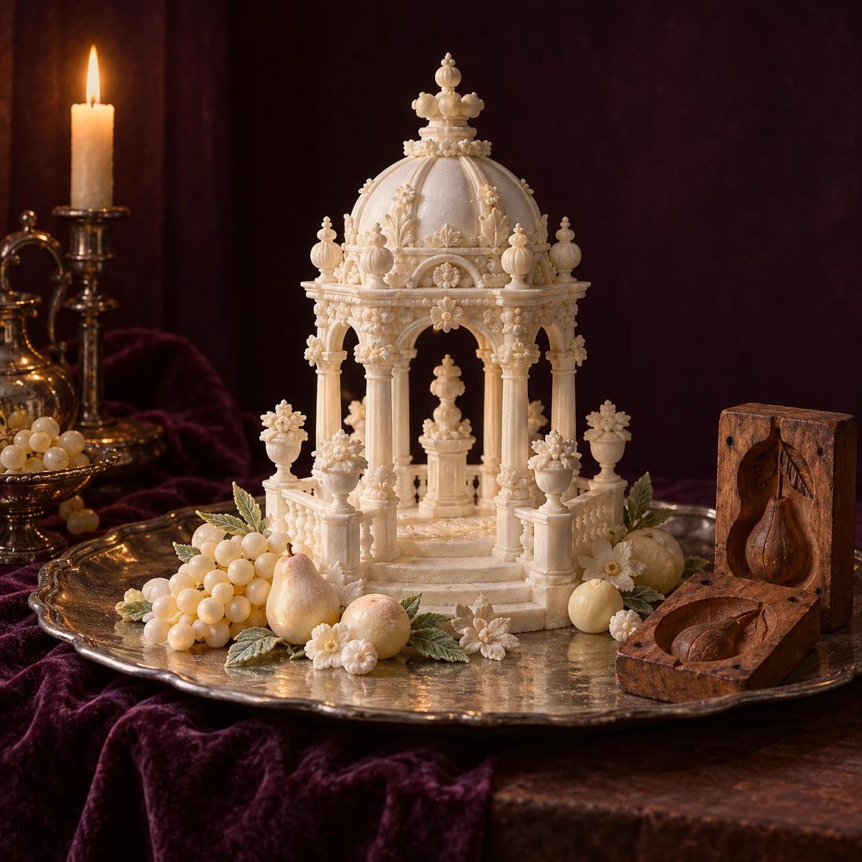
An invented early-modern European sugar banquet centerpiece on a silver-colored plain tray: delicate white sugar-paste architectural pavilion and small pale fruit forms beside a simple wooden two-part mold.
Sugar could be shaped into a temporary spectacle. This invented centerpiece directs attention to labor, molds, and materials rather than a named feast.

On the table: an object made to be seen

The Getty Research Institute's Edible Monument archive brings together festival prints, cookbooks, and serving manuals. Its examples include court table monuments made from sugar, flowers, and fruit. Heraldic and emblematic subjects connected what guests saw with the families, institutions, and occasions being celebrated.

Ask what changes when sculpture is placed among dishes. A figure on a pedestal and a figure on a dining table reach viewers under different conditions. The table establishes distances, seating, sightlines, and a sequence of service. Even a person unable to approach the centerpiece closely might understand its scale or recognize a repeated emblem.

A useful close look therefore begins with the surrounding room. Is the arrangement intended to be seen from one direction or several? Are guests represented at the table, elsewhere in the hall, or outside it? How much of the composition is allocated to food, and how much to the display of access?

Do not assume that “edible monument” means every support could be eaten. The Getty's account of festival structures describes cuccagna monuments built with wood, papier-mâché, and stucco, then decorated with food. These public constructions differ from a sugar table piece. The category gathers related forms of spectacle; it is not a single recipe or uniform object type.

After the feast: a print keeps performing

A festival print can survive for centuries after the occasion it represents. That changes its job. What began as a record or celebration becomes a source for historians trying to reconstruct a temporary environment. But a detailed picture does not stop being a designed image because its subject has vanished.

Look at the archive's digitized books as publications. Their titles, captions, and orderly viewpoints help frame what the viewer is supposed to admire. A representation can promote magnificence as well as describe it. The survival of that representation tells us something about what someone wanted remembered.

It does not automatically tell us whether every depicted detail was built, whether dimensions were exact, or what everyone present thought. Those questions require additional evidence. Treating an engraving as a photograph would lose precisely the choices that make it an interesting historical object.

Long afterward: a mold makes another object possible

A surviving tool provides a different kind of evidence. Getty's past sugar-sculpture demonstration describes food historian Ivan Day using historical equipment and original molds to ornament an eighteenth-century Twelfth cake. The resulting work was a modern reconstruction. It was not an original confection somehow preserved from the eighteenth century.

Reconstruction can answer practical questions that a flat image leaves open. How does a relief emerge from a mold? Which small forms are easy to repeat? What must be assembled after individual components are made? The answers remain connected to the particular tools, materials, and choices used in the experiment.

It is tempting to value a reconstruction only by how convincingly it resembles an old print. A more useful measure is what it makes testable and what it leaves uncertain. A failed attempt can reveal a difficulty. A beautiful success can still depend on a modern substitution. Recording both matters.

Put a mold beside a festival print in your notes. The print is strongest at showing an arrangement and the image an occasion projected. The mold is strongest at preserving one repeatable form. Neither alone supplies the entire workshop. Comparing their strengths helps explain why historians use several kinds of remains rather than choosing the prettiest surviving image.

At the end of this object biography, there may be no original sugar sculpture to point to. There are publications, tools, later experiments, and records of trade and labor. Together they allow a richer account than “people once made astonishing desserts.” The astonishing dessert becomes an entry into skilled work, controlled spectacle, selective memory, and the unequal world that supplied its material.

Sources and further exploration

Explore all 80 new articles · Browse the complete illustrated collection

Continue exploring art, ideas, and unexpected connections at Incoprea.

Thursday, October 22, 2026

A Mandala Made to Be Dismantled: Looking at a Public Sand-Painting Tradition

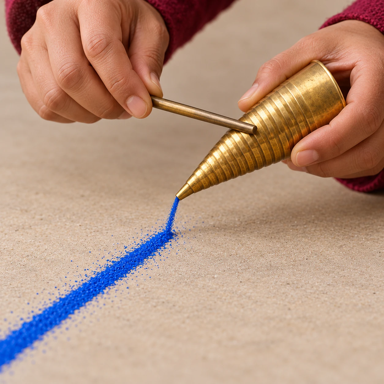
Conceptual close view of a metal funnel laying a thin line of blue grains.
Tool study; the abstract lines are not a sacred mandala or a record of a ceremony.

The difficult moment in a public sand-mandala ceremony may come after the difficult work is finished. Lines have become fields of color. Small adjustments have accumulated into a coherent whole. Then the makers begin to dismantle it. If we assume that painstaking craft must end in a permanent collectible, this conclusion can feel like a contradiction. The contradiction belongs to that assumption.

A Tibetan Buddhist mandala is not simply a decorative circle. The Rubin Museum explains that it can be a cosmological diagram and a sacred dwelling organized around a central deity. Mandalas may be made as paintings, sand constructions, or three-dimensional structures. Their meaning depends on a religious setting and practice that a pattern alone cannot reproduce.

Begin with a documented event

The Smithsonian’s Tibetan Healing Mandala archive documents a public construction following the September 11 attacks in 2001. It identifies monks from Drepung Loseling Monastery, a seven-foot-square work, and twenty monks working in shifts over two weeks. Those numbers describe that event; they are not rules for all mandalas.

The archive describes a sequence of preparation, drawing, filling, consecration, and eventual sweeping and dispersal into flowing water. Its explanation links dismantling to impermanence. It also presents healing energies as a Buddhist religious understanding. That is the practitioners’ framework, not evidence of a medical treatment.

Keeping those distinctions visible improves the experience. A visitor can take a belief seriously as part of what people are doing without converting it into a scientific claim or stripping it out as an embarrassment. Both the labor and its purpose deserve to be heard.

The precision is in the delivery

For the Smithsonian example, the colored material was powdered marble. The archive identifies a cone-shaped metal funnel called a chak-pur: rubbing a rod along its ridged surface produces vibration that releases a controlled stream. The construction begins with drawn guidelines rather than incised grooves.

That short description gives you something concrete to watch. Look for the relationship between tool position and the emerging line. Is the tip moving while the flow continues? Does the maker stop before changing direction? How does one filled area meet another? You need not know the entire iconographic program to notice disciplined handling of a granular material.

Do not infer a maker’s internal state from a still photograph. A lowered face is not proof of serenity, nor is a steady hand proof that a task is effortless. Public viewing shows actions and results. Training, attention, fatigue, devotion, and personal experience are larger matters than a camera can settle.

Watch time without losing the people

The National Museum of Asian Art offers a time-lapse recording of a mandala begun in March 2010 by Venerable Ngawang Chojor. A time-lapse is especially good at making cumulative structure legible. It is less good at communicating the duration of a pause or the physical repetition of a working session.

Use it twice. First watch the whole sequence for large changes. Then replay a short portion and concentrate on one boundary between colors. Ask what the compressed recording has removed. Speed can reveal organization while making work appear to arrive almost by itself.

A public account from UNC Pembroke in September 2026 describes another Drepung Loseling visit, this time a four-and-a-half-foot work made by six monks. The report includes a maker’s explanation of kindness and the intentional dismantling. Comparing the two institutional records shows continuity without pretending their scale, occasion, or audience was identical.

Three things a finished photograph leaves out

Order. A completed design makes adjacent elements look simultaneous. A process record can show which decisions came before others. Without that record, avoid inventing a construction sequence from appearance alone.

Sound. A silent picture cannot convey a tool being worked, spoken explanation, chanting, or the room’s ordinary movement. If a recording includes sound, listen to what it actually preserves. Do not add an imagined soundtrack and mistake it for observation.

The ending. An image of the completed surface can circulate indefinitely after the sand has been dispersed. That photograph is a durable record of an intentionally temporary work. It is not the same kind of object as the work it records.

This last distinction can change the way you share a picture. Naming the makers and occasion, linking their explanation, and including the documented conclusion gives viewers more than visual spectacle. It preserves something of the event’s own account of itself.

A respectful looking guide for a public visit

Read the host’s guidance before approaching. Viewing, photography, questions, and participation can have different arrangements at different events. A public invitation to observe does not mean every tool, symbol, or ritual action is available for casual imitation.

Choose one question that the setting can actually answer. “What material is used here?” is more useful than assuming it is beach sand. “Who selected this mandala?” respects a decision-making structure. “Where can I read the makers’ explanation?” keeps the account connected to its practitioners.

If you want a personal exercise afterward, arrange a few plain paper squares into an original temporary composition and then put them away. Use no sacred diagram or borrowed ritual. Observe your response to undoing your own arrangement. The exercise can help you notice attachment to a result; it does not reproduce Buddhist training or grant insight into somebody else’s religious experience.

Whose account accompanies the picture?

The practitioners’ own Mystical Arts of Tibet explanation describes an outlined platform, colored material delivered through vibrating metal funnels, and the eventual dismantling. It also explains consecration and blessing within its religious framework. Those statements should be attributed as the practitioners’ account, rather than turned into a universal description of every Buddhist mandala or a measured health outcome.

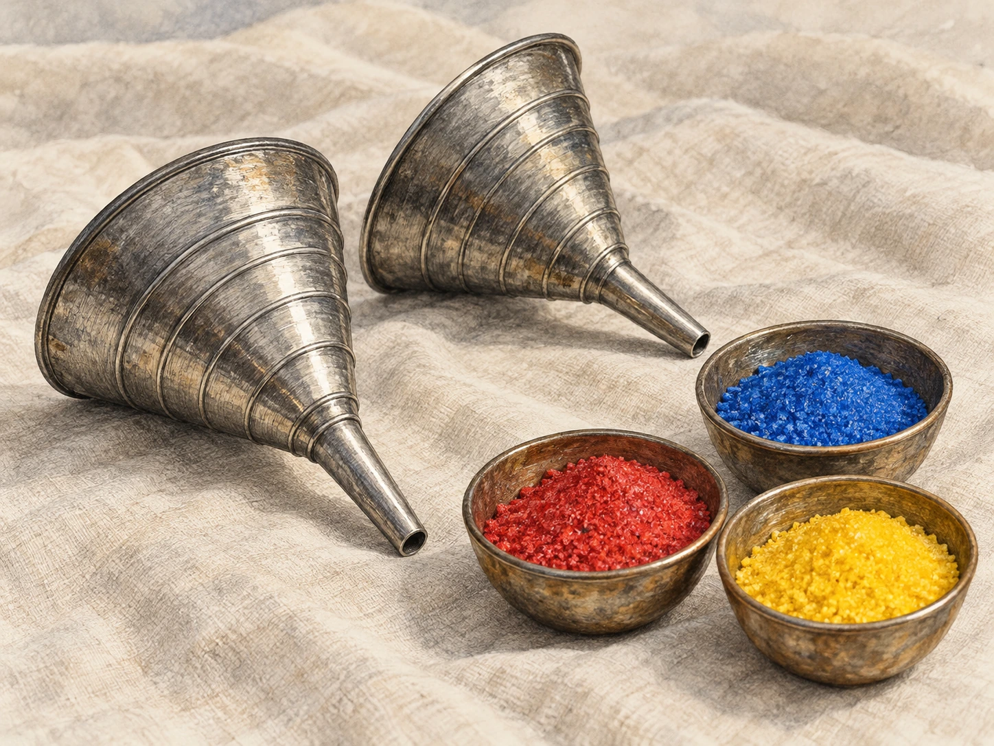
Unused ridged metal funnels rest beside small bowls of colored granular material.
Interpretive tool study. No sacred diagram or ceremony is reproduced.

A Drepung Loseling event announcement from August 2019 identifies a White Tara mandala, opening and closing ceremonies, and separate days for construction and viewing. This dated program is useful because it distinguishes an unfolding public event from one isolated photograph. Its schedule documents that event’s planned sequence; it does not establish a fixed duration for all such work.

Try making a listening-and-label card before visiting a public program or its documented recording. Leave four spaces: the makers’ names or monastery, the selected work, the occasion, and the makers’ explanation of the ending. If a host supplies only the first three, the fourth is a question to research, not an invitation to invent a poetic meaning.

Next compare three possible captions for the same finished surface. One gives only color and geometry. Another adds the makers and occasion. A third explains the documented dismantling. What kind of encounter does each caption invite? The first may be visually accurate while leaving out the event’s stated purpose. Adding context changes the reader’s access without altering a grain of the image.

For an accessible alternative to a long film, read the event program and trace the order in words: preparation, construction, public encounter, conclusion. Identify which parts a still image could document and which require a sequence or explanation. Someone unable to attend every session can still understand that the finished surface was one stage rather than the whole event.

This exercise requires no copying of a sacred design. Its subject is how an account is presented and whose voice remains attached to it. A respectful record can preserve the visual achievement while allowing the makers’ own explanation to guide the interpretation.

The final act becomes easier to understand when it is not cropped out of the story. A photograph may continue circulating after the work has been dismantled. Naming that difference lets the lasting image serve as a record of an intentional process, instead of quietly converting the process into a permanent decorative object.

Completion can include release

There are many reasons people make things: exchange, use, remembrance, devotion, learning, pleasure. Permanence is only one possible goal. The public sand-mandala events described here ask viewers to attend to a process whose final action changes the visible work entirely.

The useful question is not how anyone could bear to “waste” so much effort. It is what that judgment assumes effort is for. Looking carefully, listening to the makers, and staying with the ending allows the event to challenge that assumption on its own terms.

Sources and a closer look

Smithsonian: Tibetan Healing Mandala archive; Rubin Museum: Circle in the Square; National Museum of Asian Art: Encountering the Buddha and time-lapse; UNC Pembroke: September 2026 mandala visit.

Find more art, ideas, and unexpected connections at Incoprea.

Wednesday, October 14, 2026

Tensegrity: The Structure Held Together by What Pulls

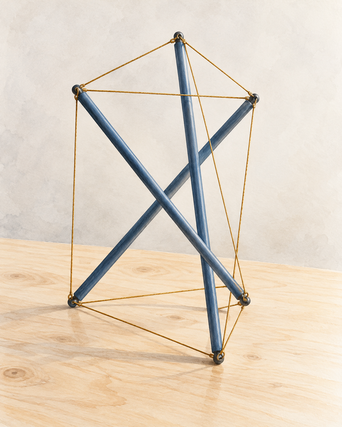
Three blue-gray struts form an open tabletop model held by taut gold cables, with no joined central crossings.
An invented three-strut educational model illustrates the interplay of tension and compression. Artwork based on an original geometric reference, rather than a named sculpture.

A skeletal arrangement of rods and cables can look as though its solid pieces ought to fall apart. Follow the cables, and the apparent puzzle becomes a structural system: the parts pulling against one another help keep the whole shape together.

This is the appeal of tensegrity. An open structure can balance tension and compression in a way that produces both striking sculpture and useful engineering questions.

A connected network holds separated pieces

In the familiar Snelson-style form, rigid compression members are separated within a continuous tension network. The rods resist being shortened; the cables pull between their attachment points. The solid members need not stack directly on one another.

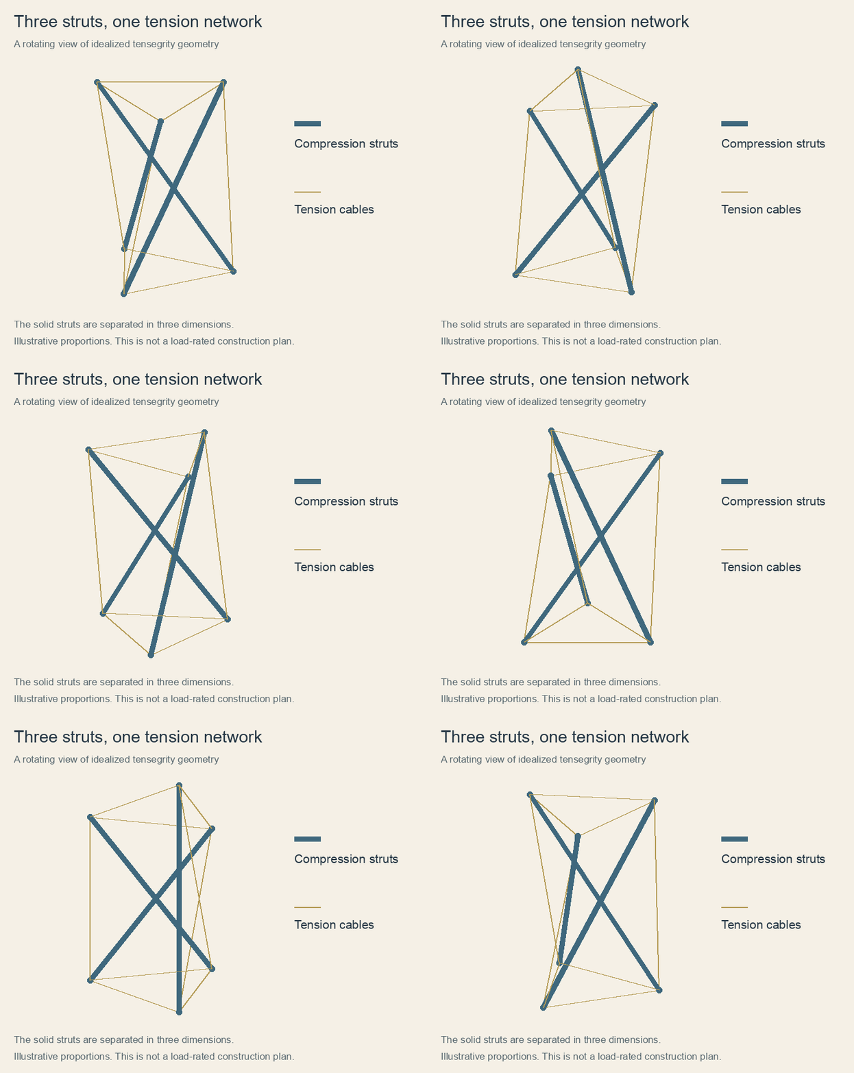
Looking from a single angle can obscure the arrangement. Two rods may cross in a photograph while passing at different depths in space. Moving around a model reveals how the cable network connects the ends and how the struts remain separate.

The tension is part of the structure's condition. A collection of loose strings and rods has the same ingredients, but it does not necessarily have the same stability. Geometry and the forces carried by the members must work together.

A rotating three-strut tensegrity schematic distinguishes blue compression members from a gold tension network.
Original rotating view of an idealized three-strut tensegrity geometry. Blue members represent compression and gold lines represent tension; solid struts are separated in three dimensions. Proportions are illustrative, and this is not a load-rated construction plan.

Follow one end, then follow the force

Use the rotating view as a small investigation. Choose the upper end of a blue strut, and follow each gold line attached to it. Watch the same end as the view turns. A line that appeared to stop at a crossing may continue behind another member. The rotation helps separate a genuine joint from an overlap created by the viewpoint.

At an attachment point, the pulls and pushes must balance for the model to remain at rest. A cable can pull along its length; it cannot provide the same useful pushing action as a rigid strut. The directions of the connections therefore matter as much as their number. Merely adding strings to an unstable arrangement does not guarantee that the strings can supply the missing forces.

This gives the empty space a practical role. It lets us see a route around the structure rather than imagining a hidden central support. Trace from one end to neighboring ends, then onward through the network. The load path involves the whole arrangement. Calling the rods “floating” describes the visual surprise, but can conceal the continuous material connections that make the surprise possible.

There is also a difference between a balanced position and a stable one. A configuration might balance at a particular instant yet respond badly to a small displacement. Prestress, geometry and member stiffness help determine how the assembly reacts when disturbed. A photograph can show its form; it cannot by itself establish how much it can safely carry.

An artist made the structural puzzle visible

Kenneth Snelson explored such arrangements in sculptures that turned engineering relationships into a visual experience. The Smithsonian's Archives of American Art documents his work, including towers, drawings, project records and patents.

Snelson studied at Black Mountain College during the summers of 1948 and 1949, where his teachers included Buckminster Fuller and Josef Albers. His subsequent career also encompassed photography and early computer art.

The Hirshhorn's collection records Needle Tower, made in 1968 from aluminum and stainless steel. Its listed height is 720 inches, or 60 feet. The open outline lets a viewer notice both the material and the spaces through which the system extends.

A small classroom model and a large sculpture share an interesting question: how can visibly separate rigid pieces participate in one coherent structure? The answer becomes easier to appreciate when the thin connecting elements receive as much attention as the rods.

Three questions to bring to a sculpture

First ask which elements are compressed and which are stretched. If a visually thick member is actually a cable bundle, appearance alone can mislead. Then ask where the connections really are. Looking from several sides often reveals the answer more clearly than staring harder from the first position.

Finally, ask what would change if one tension member became loose. You do not need to touch the artwork to consider this. The thought experiment directs attention away from isolated bars and toward the relationships that maintain the whole. It also explains why a miniature decorative model is not automatically evidence that a larger version with the same outline will behave safely under wind or a person's weight.

The same questions improve how we read claims about robots. A structure that deforms on impact, an instrument protected within it, and a machine able to choose a route are three different achievements. Demonstrating one does not establish all three. The NASA examples become more interesting when those engineering problems remain visible, rather than disappearing behind the appealing image of a ball rolling across another world.

The network can protect a payload

NASA has investigated tensegrity robots as possible landing and mobility platforms. The Super Ball Bot research considered structures that could absorb impact, protect instruments and change configuration to move.

The proposal's objectives included building rolling hardware and developing controls for navigation and difficult terrain. These were research goals, rather than evidence that a tensegrity robot had already been deployed on another planet.

A 2023 NASA account described a related terrestrial application from Squishy Robotics: sensor-equipped structures that could be dropped into difficult areas to gather information for responders. The account distinguished the company's stationary devices from mobile systems under development.

The structural principle therefore offers more than an illusion of floating bars. Its network can distribute forces around a protected center, while deliberate changes in shape provide another avenue for experimentation. What begins as a visual puzzle becomes a way to think about how a structure can hold, yield and recover.

Sources and further reading: Smithsonian: Kenneth Snelson papers · Hirshhorn: Needle Tower collection record · NASA: Super Ball Bot research proposal · NASA: Tensegrity sensor robots and terrestrial applications

Famous Last Meals is now in paperback — stories, history and 25 recipes

Famous Last Meals: Stories, History, and Recipes is now available in paperback on Amazon. The illustrated collection brings together 23 his...